What's the fastest way to get around Toronto?
If, like me, you've ever wondered whether getting from, say, one end of the Danforth to the other is faster by bike, car or transit, the eternal question may finally have been solved. A Google Maps API featured on Atlantic Cities this morning allows users to chart a route between two destinations and compare the speeds of various modes of transportation. Right now, Google doesn't let you see all three as you go.
I cite the Danforth in particular because it's the road I'm most frequently able to overtake cars on my bike and easily remain ahead. As I'm riding, the subway rumbles by a block north, a hidden competitor in the quest for Broadview Avenue. The fastest vehicle between Woodbine and the Don Valley is, according to the system developed by an American mobility expert, still the car. But it's close.
Driving on a clear road, no red lights, at the posted speed limit takes 7 minutes. The API estimates riding a bike under the same conditions takes 13 minutes. The subway splits the two, taking 10 minutes to make the trip. Still, lights and parking cars included, I'm still willing to bet the bike is a little more competitive.

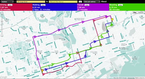
Let's take the route from the blogTO office to my neighbourhood in the east end as another example. I've wondered for a while now whether (when there's a lower risk of frostbite) if it's quicker to jump on my bike or get on the subway. According to Side-by-Side Router, it's only a minute quicker to use the TTC and walk the remaining distance. I wouldn't lose any time pedaling to Monarch Park via Shuter, River, Dundas, and Jones. With no traffic, taking a car would still get me to my destination fastest.
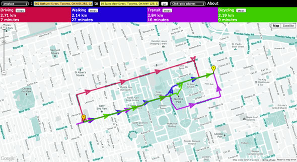
But what about a route that's well served by transit, bike markings, and, of course, roads? Between Bathurst at Harbord and Yonge at Wellesley there's a decent bike lane (some sharrows) as well as a streetcar and subway connection (via Bathurst and Bloor) so this time the results are much closer. Driving still wins, followed by biking, then public transit.

Now, these results obviously don't account for transit wait times or other unforeseen hinderances like a bad run of lights, but there seems to be a sign here that driving isn't always as fast as it might seem, especially when there are practical alternatives. Do tools like this underscore the need for widespread building of car alternatives? Could dedicated bike lanes and stats like this encourage more riders?
Chris Bateman is a staff writer at blogTO. Follow him on Twitter at @chrisbateman.
Images: "This Bike Is My Car" by cookedphotos/blogTO Flickr pool and Side-by-Side Router/Google
Latest Videos
Latest Videos
Join the conversation Load comments


