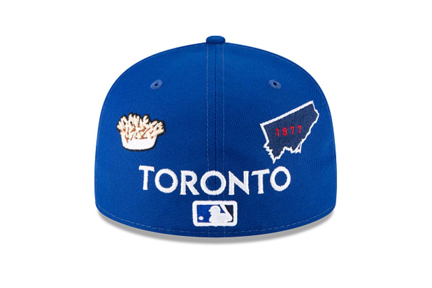
New Era Toronto Blue Jays cap got flamed so bad it was pulled out of production
New Era's has pulled the plug on its newest line of baseball caps including a laughable Blue Jays version after being relentlessly ridiculed by sports fans from around the world.
On Tuesday, New Era launched its Local Market collection of hats, which included a number of significant MLB cities, including Tampa Bay, Pittsburgh and Toronto. Minnesota Twins fans have already declared theirs the worst hat of all time.
Within hours, the company had removed the hats from its website, but not before screenshots were grabbed and memes were made. The internet has the receipts and we can confirm that the hats were, indeed, ugly AF.
The Toronto cap features the iconic local food: poutine. https://t.co/o3SUrcFTMK https://t.co/aYugZEHm6v pic.twitter.com/e41uFI35dp
— Minor Leaguer (@Minor_Leaguer) May 25, 2021
Local Market hats adhered to a common design that included logos, postal codes, and different icons, oftentimes food, meant to represent each city.
Besides the obvious aesthetic faux-pas of being hideous, many of the designs were just plain inaccurate.

New Era has pulled its new line of baseball hats, including the Toronto Blue Jays version with poutine on it. Photo by New Era via @minor_leaguer.
In the Blue Jays' case, the inclusion of a bland-looking poutine as the city's representative dish had both Toronto and Montreal Expos seething.
The front of the hat looked normal enough, but every other panel was a barrage of tiny, misplaced emblems.
Unsure why the Atlanta cap features a flying saucer? pic.twitter.com/ysZNseKYmE
— Minor Leaguer (@Minor_Leaguer) May 25, 2021
It's unclear who greenlit this, since the obvious choices would have been a beef patty , a peameal bacon sandwich or even a butter tart.
Whoever designed it must have taken inspo from the equally ugly Raptors hat last year, which included a bowl of poutine in the back and a 416 area code in the front.
https://twitter.com/SauvonsIMFC/status/1397305911253905408
Designers for this Blue Jays hat also decided to include the 416 area code while omitting every other code that belongs to Toronto, including 647 and 437.
That was probably a good thing, lest the Blue Jays hat ended up looking like the phonebook-esque hats for the Chicago Cubs or Atlanta Braves.
Either way, the hats are gone and we don't have to worry about seeing it atop anyone's head in the near future.
New Era via @minor_leaguer
Latest Videos
Latest Videos
Join the conversation Load comments


