
Toronto's lavish new hotel and condo complex not looking quite as advertised
The long-anticipated Nobu Toronto condo/hotel complex was off to a bang with a star-studded 2018 ground-breaking, featuring an unexpected outburst from Hollywood icon Robert De Niro and some very flashy renderings of two shimmering towers in the sky.
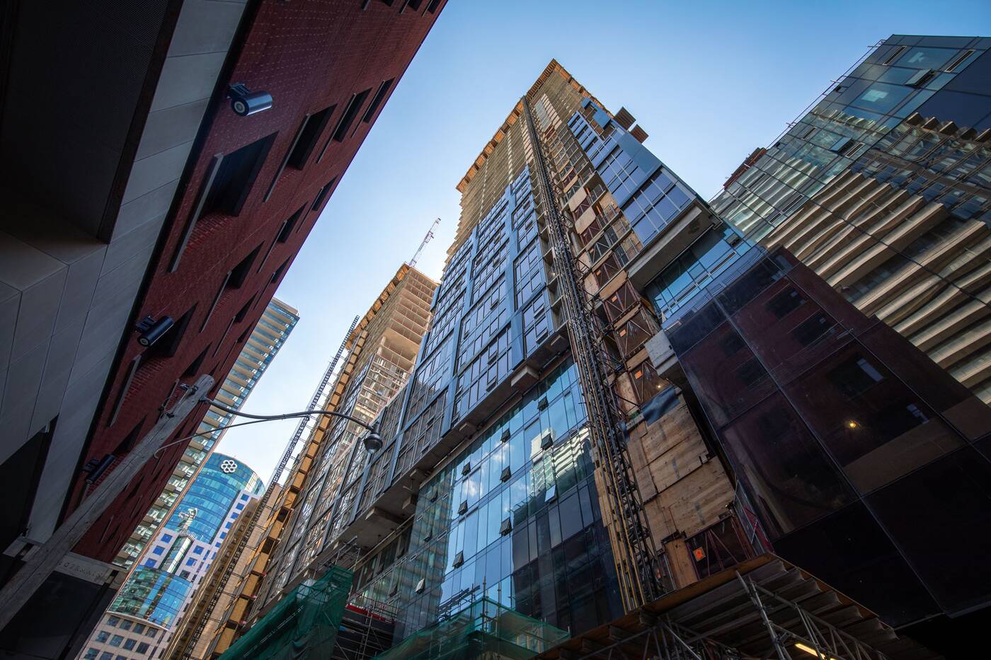
Almost four years later, the two-tower complex is well under construction on Mercer Street in the Entertainment District. But the reality now materializing is looking like a pale imitation of the chic sculptural towers promised during the project's marketing campaign.
Designed by Teeple Architects for developers Madison Group and Westdale Properties, the project was supposed to be a slice of Hollywood north of the border, its twinned 45-storey towers offering condo buyers an exclusive opportunity to invest in a property associated with cinema royalty.
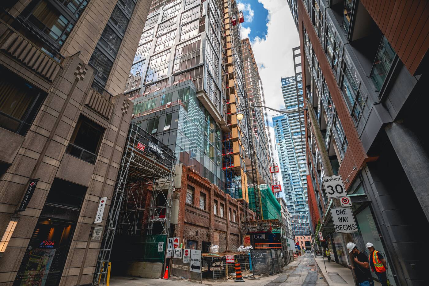
Most of this promise may wind up as accurate when the Nobu hotel and restaurant open in 2023, but the complex's material execution is certainly not living up to the images advertised to help sell the over 650 condominium units within.
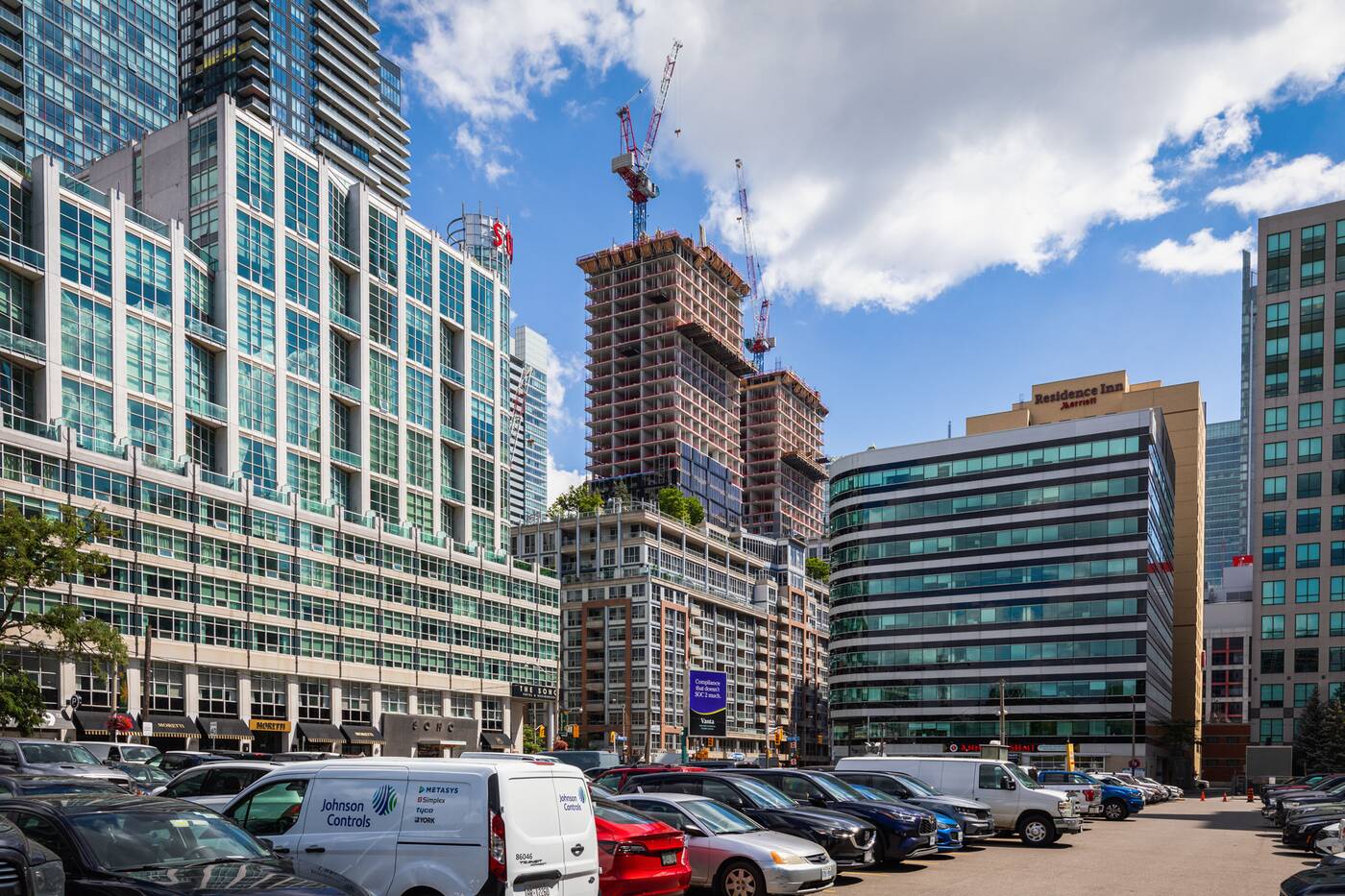
The condo marketing machine behind the project describes the buildings as "distinctive, modern, unforgettable," but photos show the use of the same type of 'window wall' style cladding used for mid-tier projects across the city.
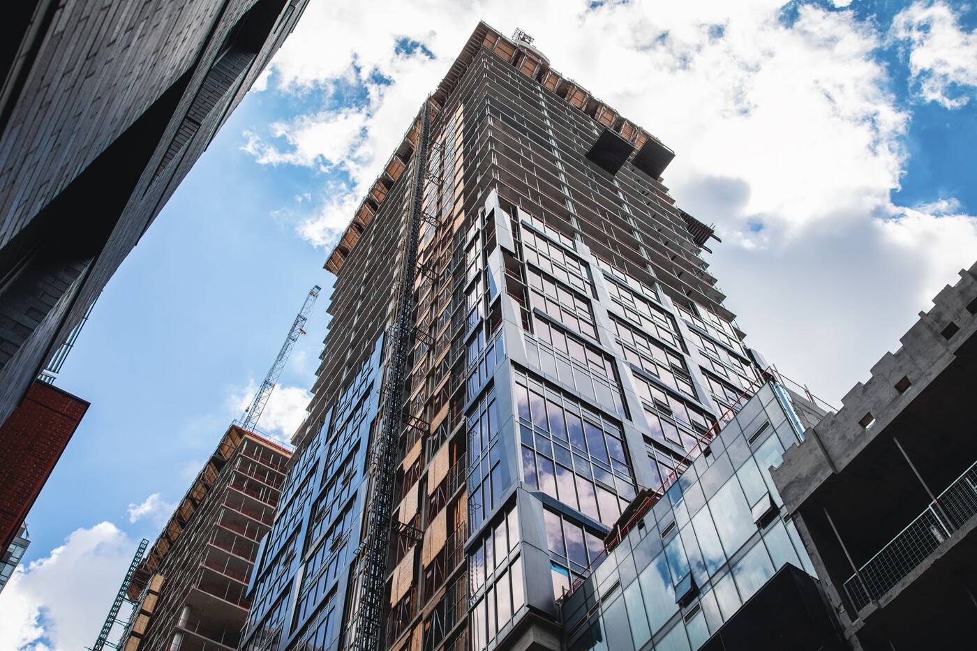
It's typically a much cheaper material than the slick "curtainwall" style glazing used on fancy new office towers like CIBC Square or the cleaner-looking hybrid systems used for some boutique and ultra-luxury condo developments.
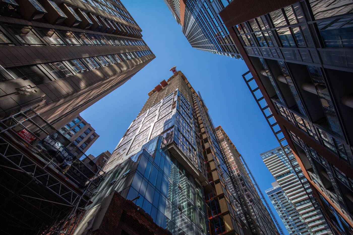
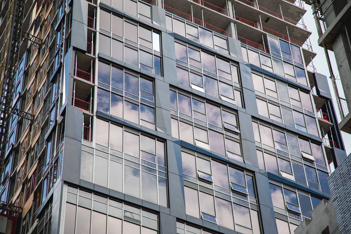
That doesn't mean that window wall cladding is inherently cheap, but the style used for Nobu, specifically its erratic placement of suite vents and jumbled-looking window mullions, doesn't scream "luxury" or "Hollywood."
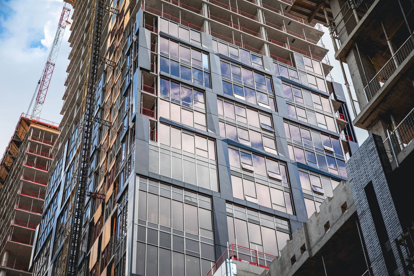 The glass itself, advertised with a gold shimmer in renderings, instead appears to the eye as a muted grey. Not even a second-place silver. Flat grey. In some light, you'll notice a bit of a bronze tint, but it's nowhere near as apparent as renderings had us all believe during the project's marketing run.
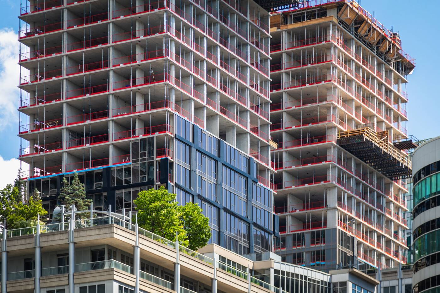
The cladding system also includes large swathes of opaque "spandrel" panels, which are not helping the overall look. However, this is a fairly common solution to hiding structural elements and bathrooms and is also a means of addressing the Toronto Green Standards' limiting of transparent surfaces on new builds.
Renderings depicted a sculptural grid of metal frames adorning the tower facades. Similar to the textured cladding used for the recent 1 Yorkville development a few kilometres to the northeast, it appears that renderings of this design feature overpromised and underdelivered.
With so many factors working against Nobu, it's really hard to blame the architects when things like this happen.
Architects frequently push for landmark designs (Teeple's original plan for the site called for an inverted-U-shaped tower) but their ambitions are often whittled away as developers hone in on a final budget.
In further defence of Teeple Architects, the firm is responsible for some absolutely gorgeous buildings in Toronto, and has proven itself capable when not hamstrung by the profit margins of condo developers.
But at the end of the day, the developers set the project cost, and it appears that the architects may not have been provided with the necessary material budget to come out with a winner here.
Nobu's hotel and restaurant are currently targeting 2023 openings, and with even flashier renderings of the complex's posh interior spaces promised early on, here's hoping everything turns out as advertised on the inside.
Jack Landau
Latest Videos
Latest Videos
Join the conversation Load comments


