Rental and office tower to bring geometric weirdness to Toronto intersection
Many cities would love to have a modern-ish, 13-storey office building with major financial tenants in a prime location. But not at the meeting point between Toronto's Financial District and Entertainment District, where a 1987-built Postmodern-style commercial tower at 145 Wellington Street West just isn't tall enough to justify its continued existence.
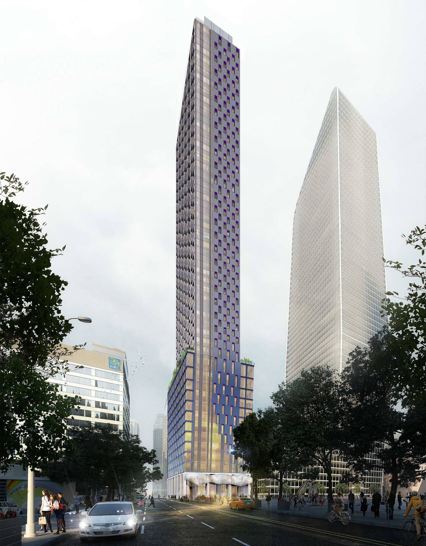
Developers H&R REIT have been planning the demise of this mirror-finish building at the southeast corner of Simcoe and Wellington for a few years now, and a combined office and rental tower could soon soar skyward from this location if plans are approved.
A development proposal dating from 2019 (and tweaked in 2020) had fallen silent but appears to have re-emerged with a resubmission to city planners back in Jan. 2022, including a revised design from Turner Fleischer Architects.
H&R had initially planned for a 65-storey building, though the revised proposal has been scaled back — but only slightly — to a new max of 60 storeys with a total height of just over 213 metres.
The plan now calls for approximately 46,900 square metres of space with around 32,352 residential area, 14,400 square metres of office space, and an almost 145 square-metre ground floor retail component.

Offices are planned to occupy the majority of the building's 14-storey angular base, with commercial space on levels two through 13. The 13th floor would be shared between office and residential amenity uses, while the 14th and final podium floor would be entirely dedicated to amenity space.
It's a significant amount of office space for a Toronto mixed-use project, the developers opting to demolish the current building but create a whole new, modern office presence on the site.
Above, the tower component would contain 428 rental units in a mix of 231 one-bedrooms, 152 two-bedrooms and 45 three-bedroom units.
Changes to the exterior serve more as an evolution from the 2019 design than a departure, retaining the chamfered base, dissolving grid pattern, and overall shape seen three years ago.
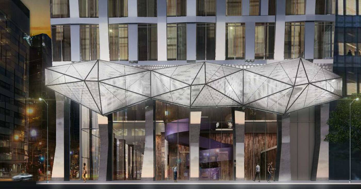
But it's the changes made to the base that really set this iteration apart from the last one, incorporating sculptural columns and a funky geometric canopy over its Simcoe Street entrance.

Unfortunately, renderings only tell an idealized version of the story, and a closer look at architectural plans reveals that not everything may end up as pretty as advertised.
Plans specify that large swathes of the exterior would take the form of opaque grey spandrel glass. While not widely discussed outside of development and architecture circles, this material is the type typically associated with "ugly" residential buildings.
Lists of ugly buildings may be entirely subjective, but you're sure to find many containing entries of towers sharing this cost-effective exterior finish.
Latest Videos
Latest Videos
Join the conversation Load comments


