Kiosk King East
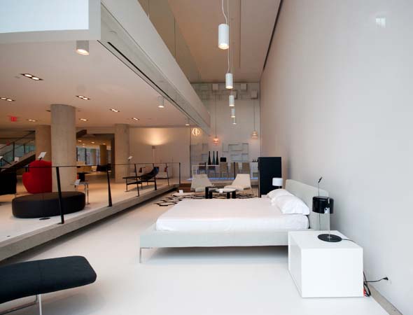
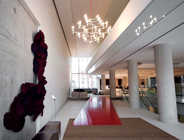
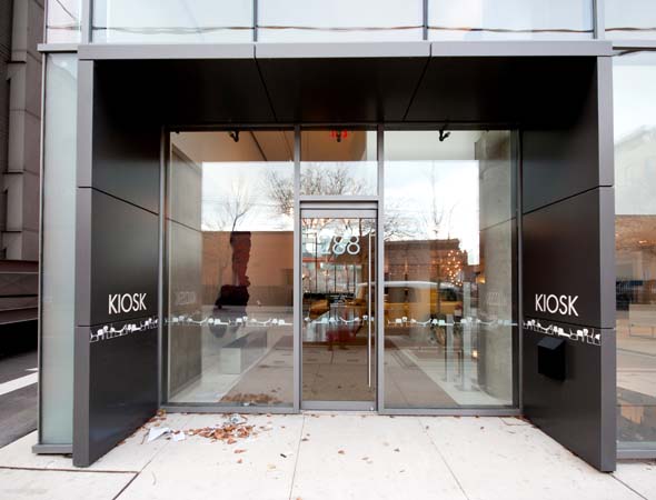
Kiosk has opened its latest store in Toronto, this one near King and Berkeley just a stones throw from Klaus . The new showroom is essentially a multi-level museum of avant-garde furniture, extraordinary design items and boundary-pushing decorative elements. It's also a beautiful space that intelligently mixes glass, metal and wood that lends this store an atmosphere of a kind of "colourful sterility."
Kiosk isn't new to the Toronto design scene. They have long had a store on Jarvis near King and just recently closed their Dupont/Christie location in favour of this latest effort. The new Kiosk showroom is incredibly spacious, with three floors dedicated to the stylish (and expensive) furniture we've come to expect from them. Each piece is well separated from the next, allowing the shopper to peruse the showroom a little more slowly and carefully. During my visit, I found myself stopping and standing at practically every item, admiring each piece intimately like it was a work of art.

In some ways I'm used to furniture stores that display their furniture arranged like it would be used in my home, like seeing a rug, coffee table, couch, side table and lamp all staged and displayed nicely together to make me convinced that somehow I could achieve this look in my own house. With Kiosk, it's a bit trickier to make that mental transition to imagine it all working in my own place. But, in some ways, so many of the pieces were knock-outs that I might be inclined to think they would have the same dramatic impact outside of the showroom.
This type of layout at Kiosk really made me pay attention to items that I may have overlooked at other retailers. For example, I was really taken aback by the "Daddy Long leg" floor lamp with spidery, skinny, metal legs and big fat top for $1,943. It had a lot of life and personality to it and looked like it could scurry away at any second.
There was also a dark grey and oak media storage unit that was quite handsome and elegant for $6,417 and an "Eileen" dining table, also oak with grey accents for $4,880. Both of these pieces would complement each other well, or really stand out as show stoppers in any home or space.

I also loved the "Up 5" armchair and matching "Up 6" ottoman designed by Gaetano Pesce. The two items are attached and supposedly they symbolize female shackles. But, all I saw was the coolest and most comfortable looking armchair I've ever seen. Looking like a giant red balloon, it has soft, rounded curves and kind of looks like the chair would be giving anyone who sat in it a bit of a hug. For $3,678, it's tempting to save up for this kind of statement piece.
Downstairs at Kiosk, I spent quite a bit of time examining the Carlo Mollino designed "Carvour" writing desk for $13,280. It reminded me a bit like a sailboat as it had a wide, sleek and smooth plate glass top, with glossy black parts attached to a highly varnished oak frame. I couldn't decide if I'd rather sit at it to write the next great Canadian novel or stand behind it and fire all my underlings. Either way, it's a powerful desk and a thing of beauty.

The third floor of Kiosk is a bit more refined and elegant as it's where they display their French design pieces. Again, everything is very chic, but in many ways also very practical. I enjoyed many of the dining chairs, bookshelves and storage units. Again, I took my time browsing and appreciating each piece and really began to understand that many of these items could either be integrated seamlessly into my own place to give it a bit more polish and maturity, or I could utilize a similar technique as Kiosk and arrange any item so that it could serve as a centrepiece around which everything else in the room would evolve from. Either way, the furniture and accessories at Kiosk are beautiful, useful and stylish.
Kiosk is a great store to visit, and if the cash flow is there, then it surely is a great store to shop. The designs are cutting edge, without being offensive and they are all functional, usable and in some cases, incredibly welcoming. The new showroom itself is beautiful and only serves to elevate everything above standard furniture and turns them into pieces of art.

Photos by Dennis Marciniak who tried his best to get photos of the space by shooting through the windows because Kiosk management wouldn't allow him to take any photos from inside the store.


