
Someone just gave TTC displays an impressive redesign
One Toronto-based designer recently proposed transforming the TTC's existing bus information displays in an effort to enhance their overall effectiveness and address usability challenges.
Shaban Mohammed is a mechanical engineer turned UX/UI designer who has been working in the industry for over five years.
Besides wading into TTC redesigns, Shaban has also put together a case study focused on transforming the virtual queuing experience at the City of Toronto service counters.
"To me, UX Design promised a fulfilling journey, perfectly intersecting my natural predilections with the chance to forge solutions that really make a difference, all while untangling the complex web of user and stakeholder problems and needs," he told blogTO.
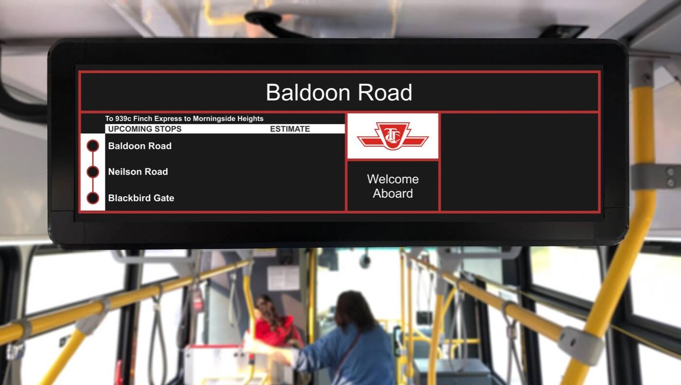
The TTC's Existing Bus Info Display (BID). Photo: Shaban Mohammed.
For Shaban, the inspiration for redesigning the TTC's existing Bus Info Display (BID) came from both personal experiences and collective commuter feedback.
"My own confusion and frustration with the current 'Stop Request' feature was what initially caught my attention. After engaging in conversations with fellow commuters, it became clear that my experience was not an isolated incident, but rather a shared inconvenience among many," he explained.
The TTC recently introduced the new large information displays on their buses, which replaced the smaller dot matrix LED displays.
While the new displays have the capability to show more information — including upcoming stops, estimated times of arrival, and transcribing announcements — the study argues that there are untapped opportunities to redesign the displays to offer more value to commuters.
Usability issues with the current displays were identified through field studies by commuting on regular and express route buses and interviewing nine commuters of various demographics.
"For commuters, this information is more than just data; it's a guide that helps them navigate their journeys efficiently and make informed decisions," Shaban explained.
"The primary complaint I've come across centres on the BID's information swapping feature. Commuters are often vexed by the way essential details such as stop name or stop request status are temporarily replaced by less critical information, like the time of operator ID."
With the feedback in mind, Shaban says the goals of the screen's redesign included providing commuters with relevant information, organizing information, and enhancing relevance.
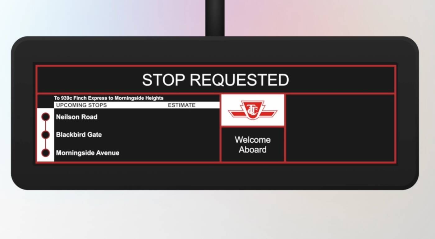
The TTC's existing stop request feature. Photo: Shaban Mohammed.
One feature redesigned in the case study is the BID's stop request. While the feature may seem small, the designer says it plays a crucial role in confirming to passengers that their stop request has been received.
With the current system, Shaban found that passengers often find themselves pressing the stop button multiple times, even after hearing the confirmation chime, due to delayed visual feedback.
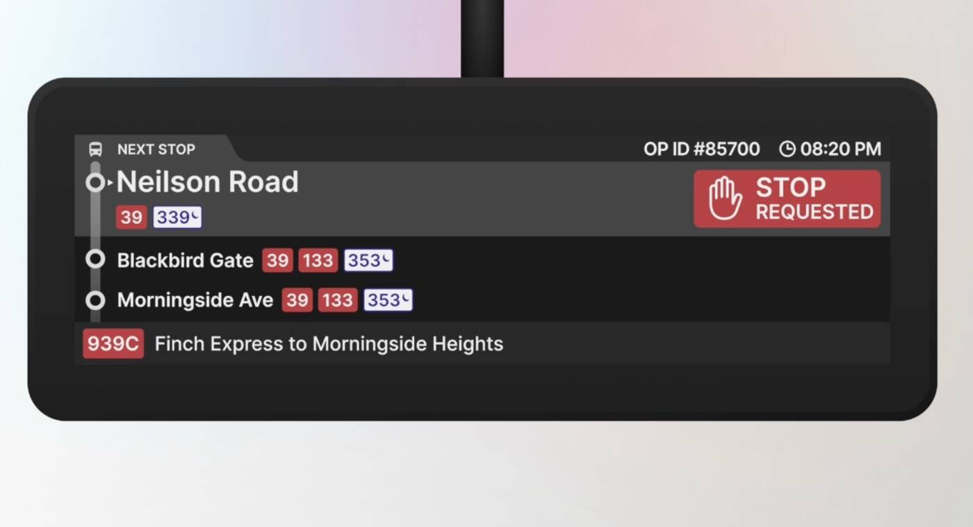
The redesigned stop request feature. Photo: Shaban Mohammed.
The revamped stop request seeks to utilize visually appealing designs to capture passengers' attention, provide clear confirmation, and enhance noticability.
The case study also centres around the BID's announcement feature — which is a vital component that enables bus operators to broadcast pre-programmed announcements to passengers.
"Whether it's visual notifications for passengers with hearing impairments or auditory announcements for those with visual impairments, this feature plays a pivotal role in making public transit more accommodating and user-friendly for all commuters," the study reads.
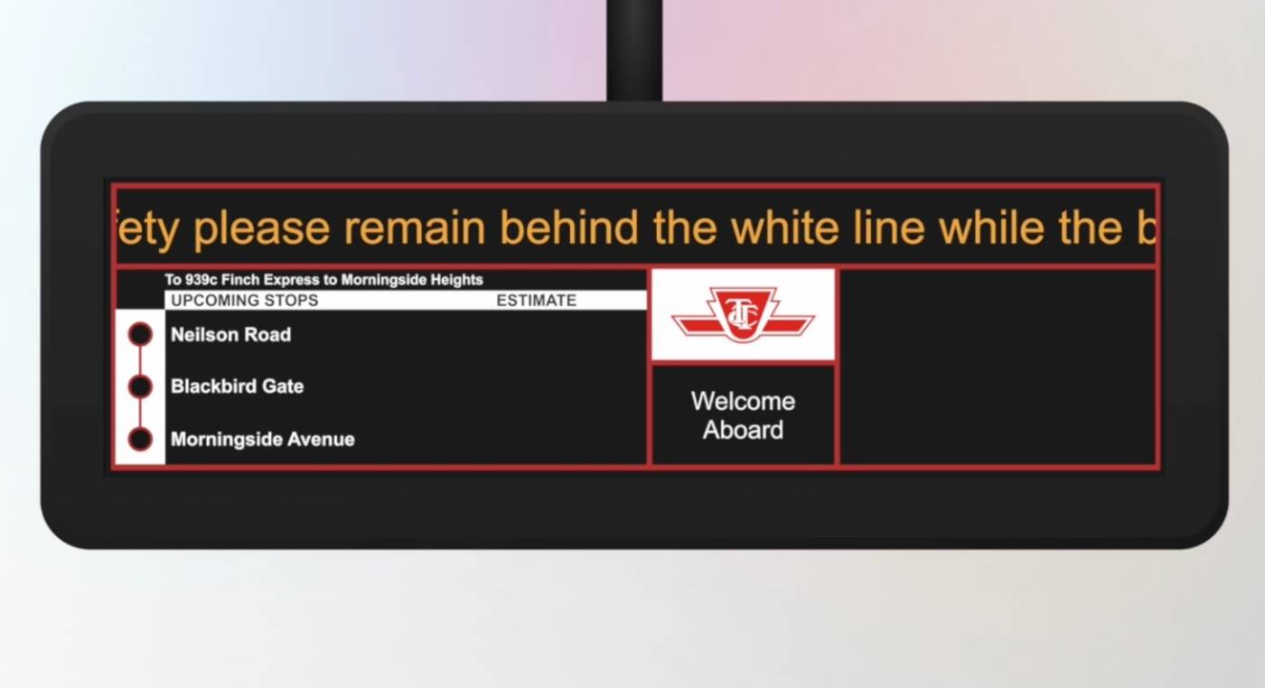
The TTC's existing announcement feature. Photo: Shaban Mohammed.
According to Shaban, the current design presents a challenging comprehension, as lengthy lines of text "can be daunting for some users," and tracking moving text on a bus in motion also demands a lot of effort.
The revamped design seeks to boost comprehension, enhance visibility, and minimize cognitive load with continuous and clear visibility.
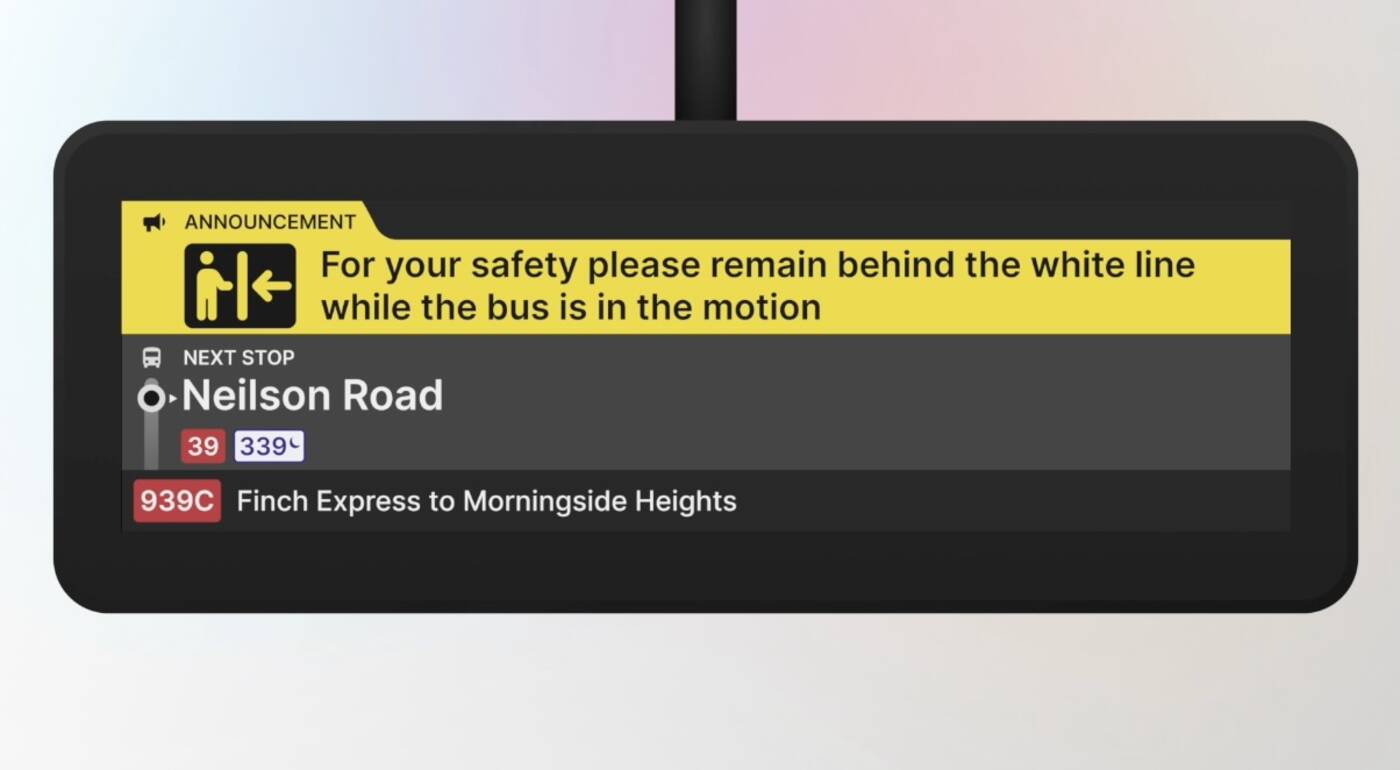
The redesigned announcement feature. Photo: Shaban Mohammed.
Shaban also highlights the untapped potential in utilizing the BID's extra available screen space for the integration of service alerts and advertising features.
By designating space for service alerts, he says passengers can be primed for potential changes in their travel plans, and advertising opportunities can create an additional revenue stream.
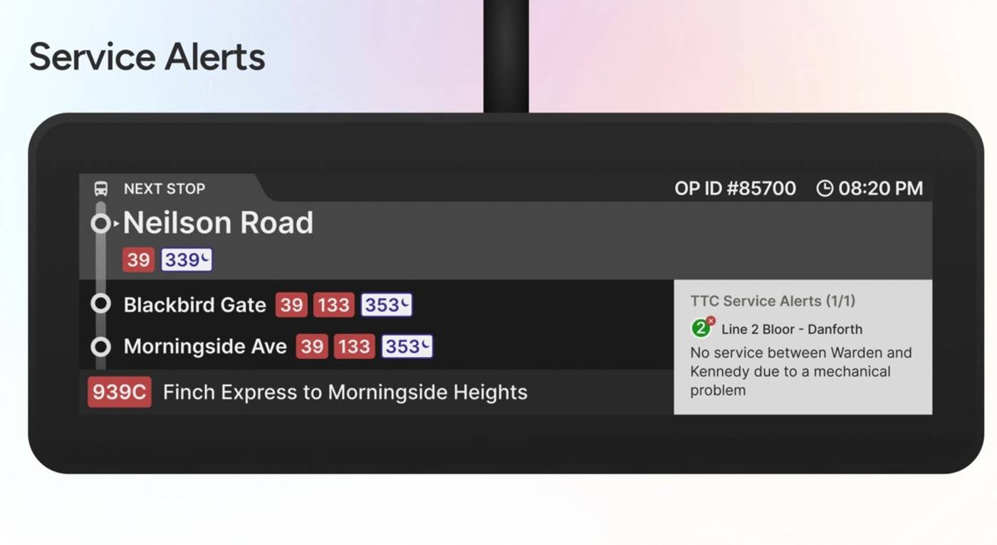
The redesigned service alerts information included in the BID. Photo: Shaban Mohammed.
Shaban told blogTO that the feedback from transit riders has been "wonderfully positive," with commuters expressing their appreciation for the effort to declutter the current design.
While he hasn't received a response from the TTC yet, Shaban says he remains hopeful for future dialogue and the potential to collaborate.
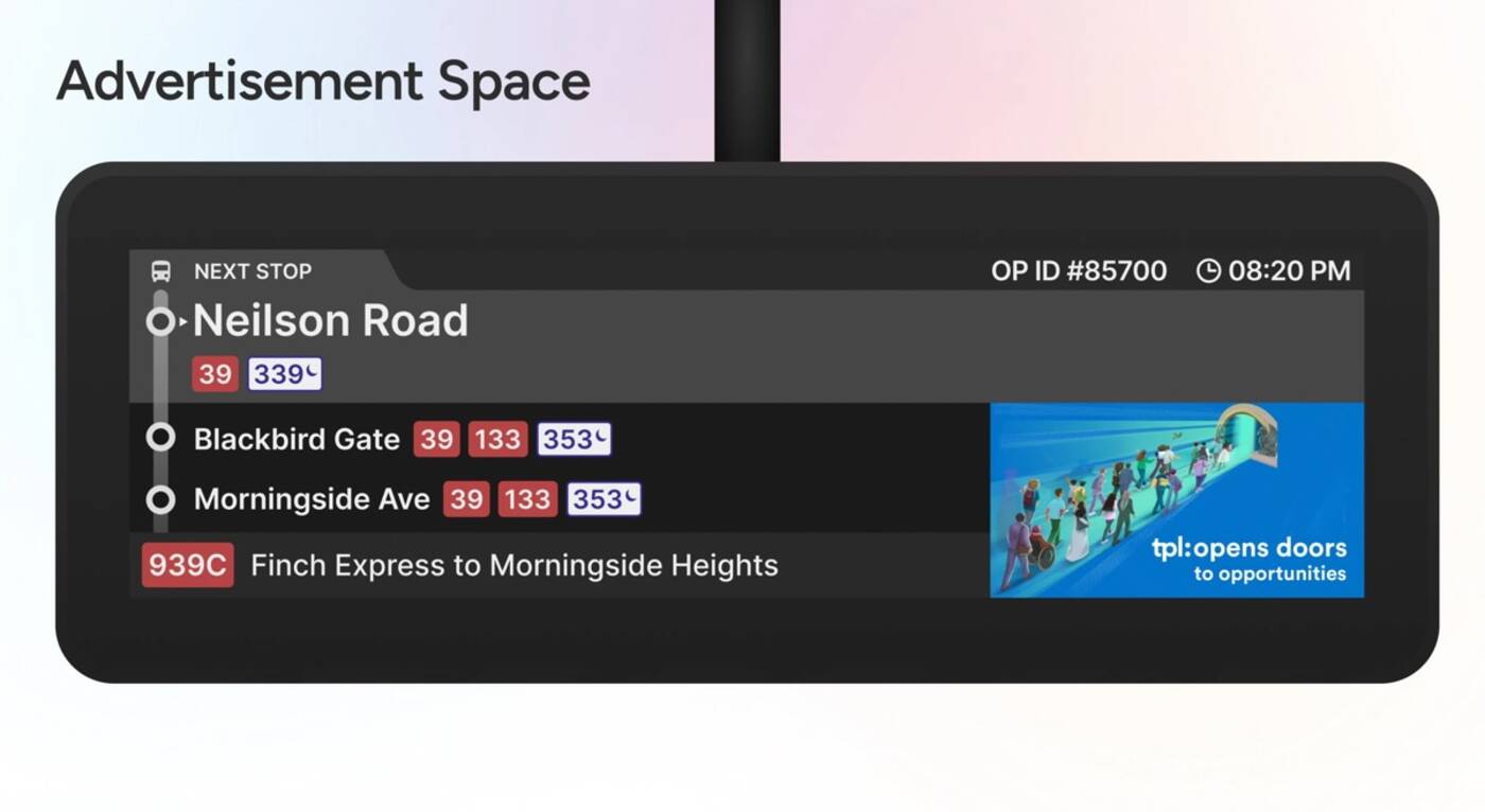
The redesigned BID includes advertisement space. Photo: Shaban Mohammed.
"A well-designed BID enhances the commuter experience, making public transit more appealing and convenient, which leads to increased ridership and a shift from private vehicles, ultimately reducing carbon emissions," he notes.
Shaban also emphasized the significance of continuous user feedback in the UX field, particularly when it comes to public service products.
"Even minor enhancements can greatly improve user satisfaction and overall experience," he said. "The effectiveness of communication does not solely rest on what is conveyed but also on how it is presented."
Shaban Mohammed
Latest Videos
Latest Videos
Join the conversation Load comments


