
Here's what GO Transit looked like in the 1970s
Toronto has always been the nerve centre of commerce and employment in the region, and it takes a constantly-evolving commuter transit network to move the working masses in and out of the city.
GO Transit answered that call in 1967, becoming the country's first regional commuter transit system, and Metrolinx is offered a look back in time at the network's infancy with a series of compelling photos shot in just the fourth year of GO service.
The photos transport viewers back five decades to a very different-looking GO Transit system, the way commuters experienced it in 1971.
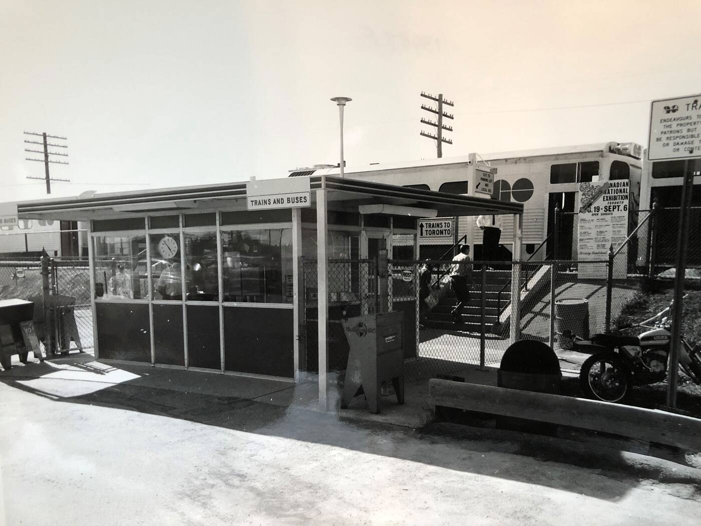
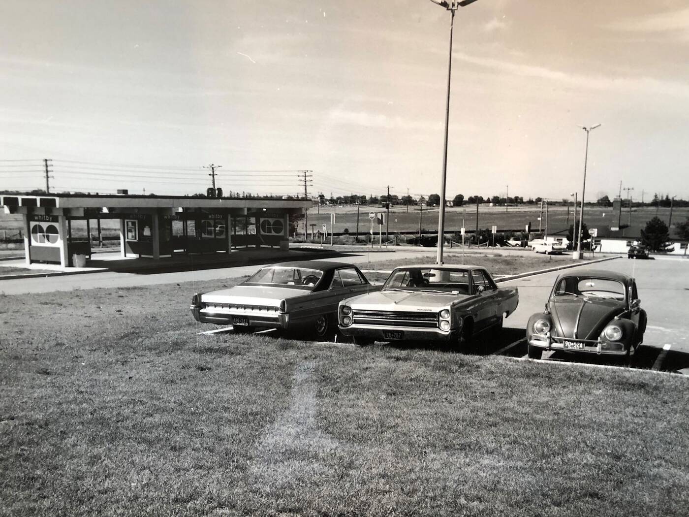
Clean lowercase station names and the iconic GO logo worked nicely together with the early network's mid-century modern look.
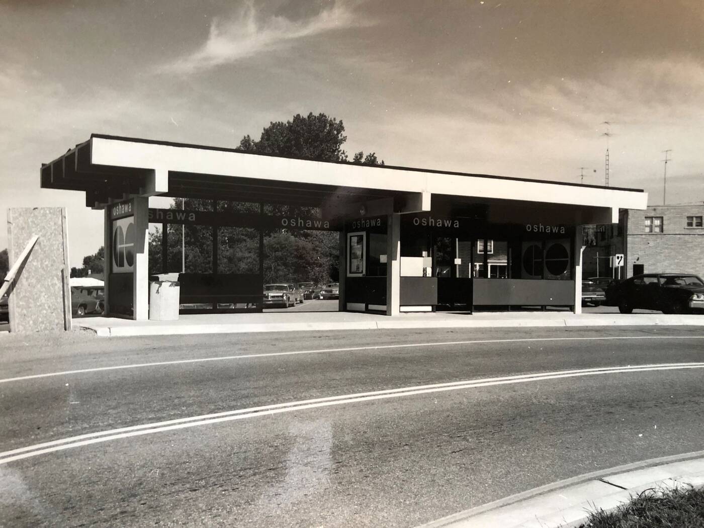
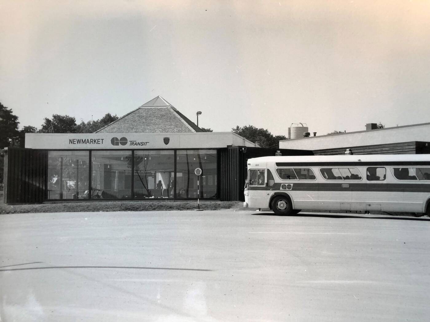
Stations like Whitby and Oshawa showed off this clean minimal look, while others, like Newmarket, took on more of an early Postmodern style.
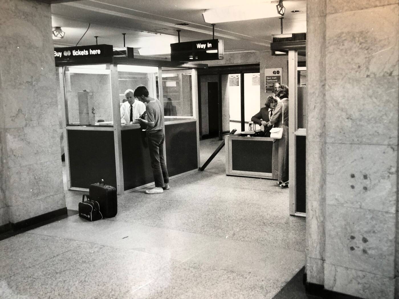
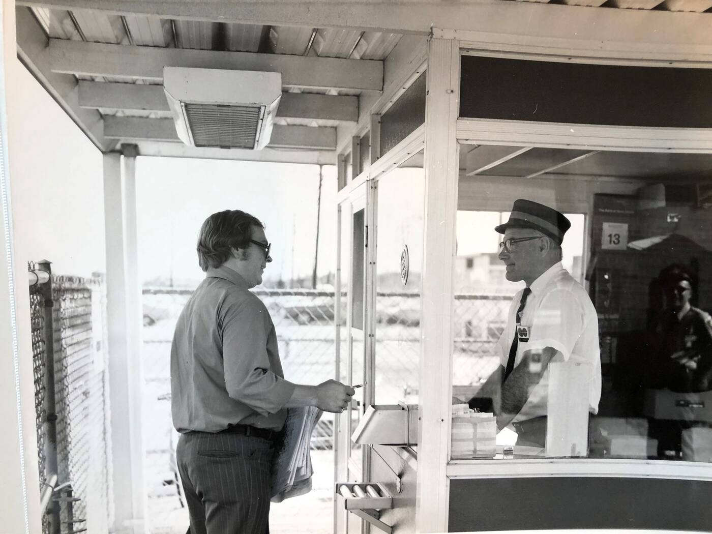
Even the ticketing booths seemed more elegant in the network's early days, when wayfinding signage followed the minimalist design principles of the era.
 Ever wonder what the original GO trains looked like? Check out that old-school bell on the front.
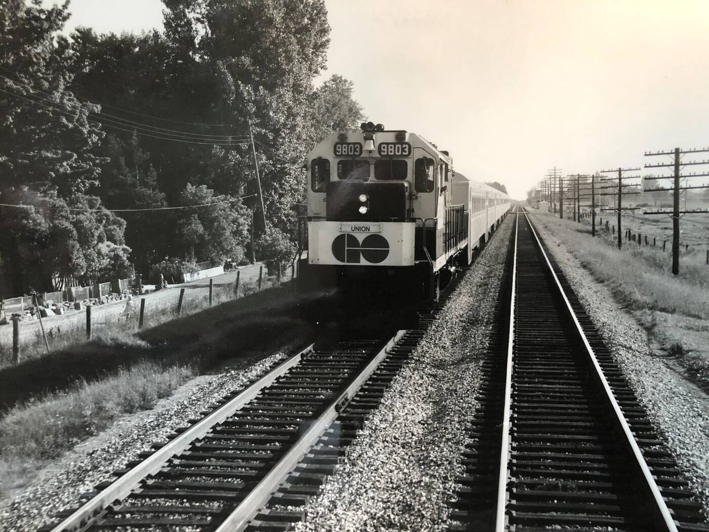 The logo may have endured for all these years, but GO employees are probably thankful their uniforms no longer include these goofy conductor-style hats. Also, is that passenger buying a ticket a Michael Caine doppelganger?
And oh, the cars. In addition to the vintage buses and trains featured in this collection, these throwback photos also feature some views of the commuter parking lots serving stations, housing some distinctly retro automobiles.
And even rarer than the vintage cars, nothing speaks of the pre-mobile era quite like phone booths. You're more likely to see a Volkswagen Beetle chugging down the road than encounter a phone booth in your travels in the current era, the latter approaching extinction.
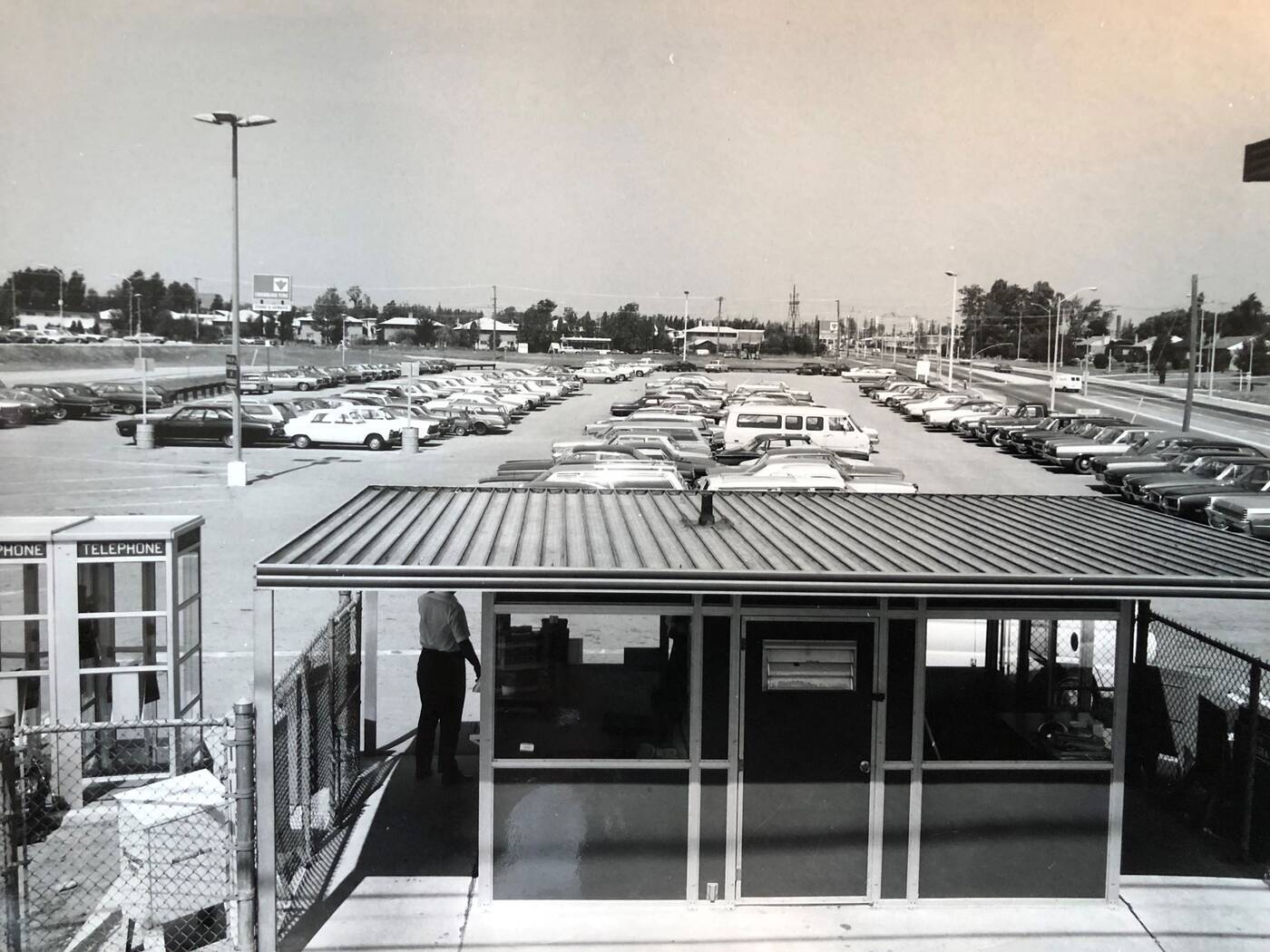
Whether you're a transit enthusiast, a car aficionado, or a history buff, this window into the past is a fun look back in time.
Metrolinx
Latest Videos
Latest Videos
Join the conversation Load comments


