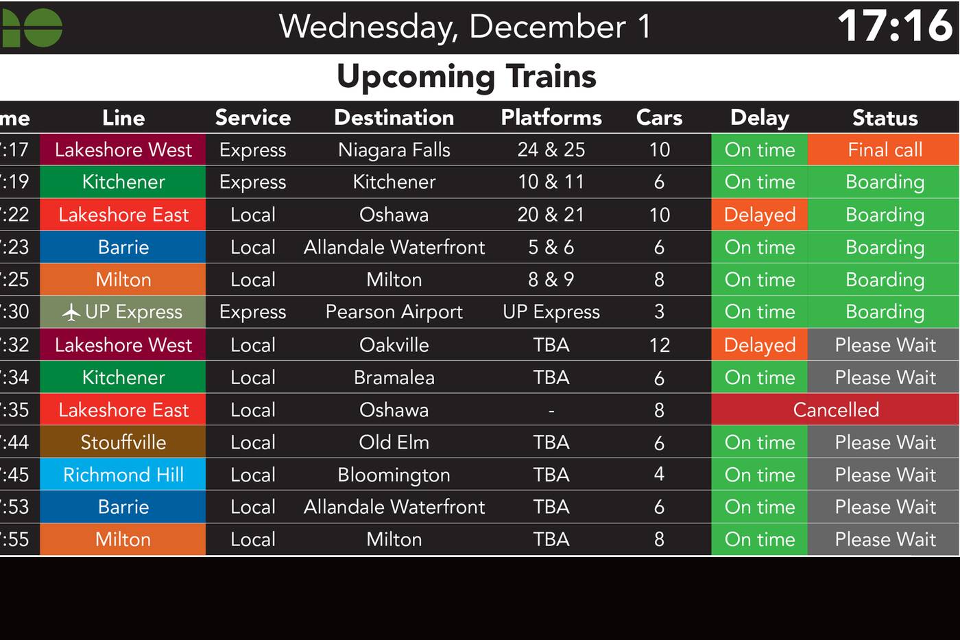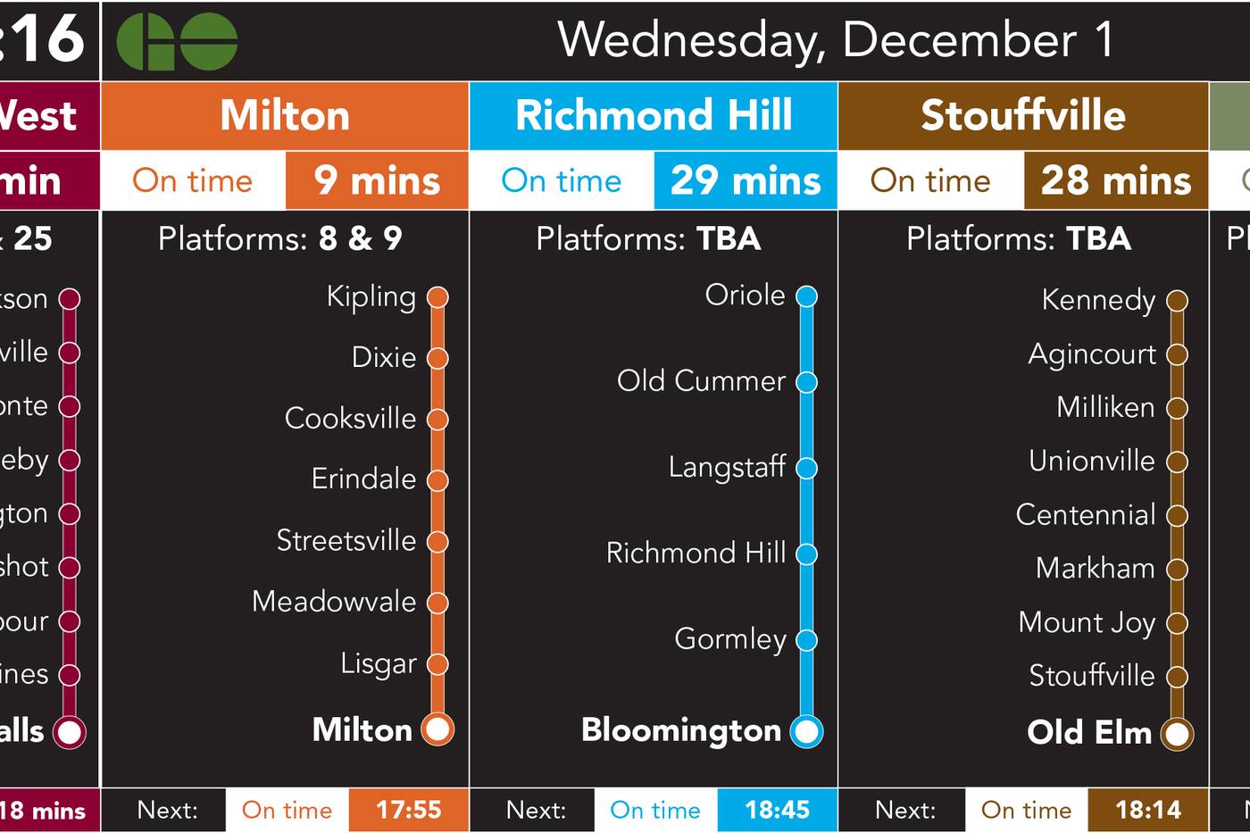
Student creates schedule signs for Toronto's Union Station and officials like them
An urban planning student at the University of Waterloo didn't like the departure screen signs in Toronto's Union Station, so he designed better ones.
While he attends school in Waterloo, Justin Fan, 19, says he regularly uses GO Transit to visit friends in Toronto but found the signs listing the scheduled departures difficult to read.
"The text is really small, it's not really clear, the information is just not really clear," Fan tells blogTO.

Fan uses colours in his sign design for clearer reading.
People end up standing in front of the signs for several minutes to figure them out, particularly if you are waiting for the list of the bus or train stops.
"It shows like two stops at a time and scrolls in this tiny list," he says. "You need to look at the sign for like a long time to see where your train would actually stop."
As a second-year urban planning student, Fan has a big interest in transportation and improving how cities work.
"Even like small things like the signs would make a huge improvement to navigation usage of our local transit system."

Fan's sign design includes a list of all the stops for each train or bus.
So he went home and worked on new sign layouts on his computer. He came up with some preliminary designs and tweeted them out, tagging Metrolinx.
Metrolinx spokesperson Anne Marie Aikins responded a few days later.
Some of your ideas are definitely worth exploring staff tell me. good ideas. We have just issued an RFP to have a new CMS that will pull all of our data in real time into a centralized tool that will expand our technical capabilities to show data similar to what you’ve created.
— Anne Marie Aikins (@MetrolinxSpox) December 8, 2021
Fan was surprised to hear back.
"I didn't expect them to actually take it seriously like some kid who just draws artwork in his bedroom," he says.
Fan asked regular GO transit riders what they thought about each draft and how it could be improved for accessibility and readability. It went through many iterations based on feedback, he says. He sent Aikins the final designs, and she tells blogTO that staff are impressed.
"Staff said his ideas were definitely worth exploring, and coincidentally, many of his suggestions were already being considered," she says. "So he is definitely a smart guy with terrific ideas."
GO Transit actually sent a survey to commuters to ask their opinion on the new sign designs.
So @GOtransit sent out a survey today.. liking the design! @MetrolinxSpox is this related to my recent submission? pic.twitter.com/S7lE9cZTjh
— Justin Taylor (@not_taylorx) December 14, 2021
Aikins says the survey was ready to go before they saw Fan's designs but she says, "I think it is great that we were all on the same page and I think the right direction."
Fan says he likes one of the concepts he saw.
"It's very clean, it is a lot better than the current design."
He likes the colour coding for the stations but would still like to see a list of the stops.
Latest Videos
Latest Videos
Join the conversation Load comments


