New in Toronto real estate: Beach Hill Residences
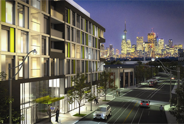
Beach Hill Residences is not lakeside. Sorry. But it is on a hill, that overlooks a community, that's right beside the beach. That's something, eh? Located in the Upper Beaches by Woodbine and Gerrard, this Carlyle Communities project brings modest height, a speckle of lime green, and.. uh.. "eccentric" floor plans to the neighbourhood above the beach. Here's what you need to know about Beach Hill Residences.

SPECS
Address: 763 Woodbine Avenue
Number of floors: 7
Total number of units: 64
Type of units: Studio, one-bedroom, one-plus-den, two-bedroom, two-plus-den
Unit sizes (in square feet): 483 - 1009
Price range (approx.): $239,000 - $495,000
Parking: $29,900 (for select suites)
Maintenance: $0.56/sf
Maintenance fees exclude: Hydro, gas
Architect: RAW Design
Interior design: Union31
Sales company: Brad J. Lamb Realty Inc.
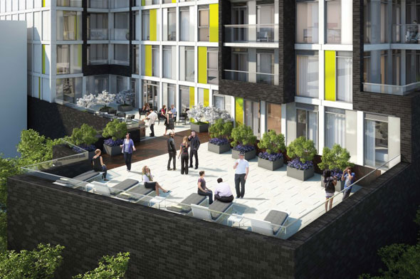
Amenities: Common room, terrace
Expected occupancy: December 2014

THE GOOD
Rather than a box on the 37th floor of the eighth condo tower on King West, you might be treated to a little community with a Beach Hill home. And believe it or not, some potential buyers still care about such supposedly trivial things! The structure is a very palatable seven stories tall, with few enough units that you might actually get to know your neighbours. The area around Woodbine and Gerrard boasts a heavy residential presence, along with enough action on the retail end that you can count on a good morning coffee and a solid place to ring in the weekend. In that way, the Upper Beaches seems to offer a good balance of commercial and community. And while I wouldn't call the area undiscovered, per se, it's certainly not facing the type of development bombardment now characteristic of some areas south of Bloor. Wait for it?
Accessibility is another big win for Beach Hill. For one, the TTC streetcar passes right by the building, and Woodbine Station is no more than a five-minute walk away. Plus, the area doesn't come with the same sort of congestion (traffic and pedestrian) that you'll find further south and/or west, which should make for a (somewhat) easy commute.
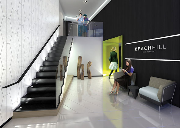
And whatever route you end up taking, you can keep your head high knowing you paid little more than $500 per square foot for a condo on the subway line. Nicely done, savvy shopper — you weren't swayed by promises of frivolous day spas or three-storey lobbies or the assumption that thousands of residents on the same block will make for an enjoyable living experience. Let them pay $700 or more for each square foot of airborne laminate floor — you've got accessibility, community, and room to breathe, with an extra $200 per square foot in your pocket.

THE BAD
Hey, haven't I seen you before? No wait, you've got black and lime green accents. My mistake. But nevermind its uncomfortable resemblance to the supposedly one-of-a-kind Brant Park Condominiums, Beach Hill has a much bigger issue when it comes to the layouts of its suites. What are these things?! I understand wanting to diverge from the typical boxy shape, but I'm not sure a drunk trapezoid was quite the right figure to employ in its stead. Some of these unit floorplans look as though they were traced totally freehand, with glass-walled tapered living rooms narrowing à la Willy Wonka's funhouse. Even the spacious 1,000-square-foot unit is soiled by a bedroom in the shape of a hand giving the middle finger. How is one supposed to furnish such suites, or more importantly, actually make livable use out of an erect-middle-finger corridor? Seems a waste to me, though I might just be dizzy from too much floorplan exposure.
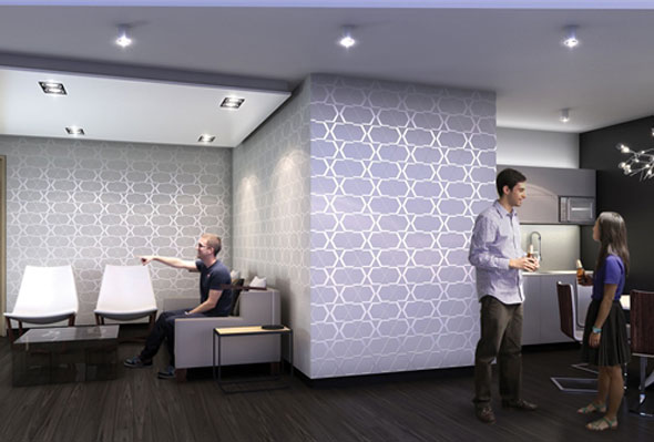
You would think with more than 1,000 square feet to play with for a one-plus-den unit, someone would be able to find a way to give that bedroom a window. Alas, not so. Unless you work with developers to totally reconfigure your suite, you'll have to look inward for that little taste of sunshine (sucks for me, I know). Beach Hill, like too many new developments, is guilty of trying to get away with bedrooms without windows (and awkwardly shaped ones, to boot), with the saddest little assembly line of kitchen appliances I've seen in a long time. Would it kill someone to sketch in a breakfast bar or kitchen island once in a while? Yes? OK — I'll just chop vegetables on my lap, thanks.

THE VERDICT
Great concept from the outside. Poor interior execution.
What do you think? Would you live here? Add your comments to the thread below.
Read other posts in this series via our Toronto Condos and Lofts Pinterest board
Latest Videos
Latest Videos
Join the conversation Load comments


