noteTOself: Become a Brand Manager
noteTOself is a weekly roundup of some of my freshest sketches. Perhaps it will be your new BFF for your Wednesday middle-of-the-week crisis?
This week I got some motivation from Nav's post from the other day on Branding TO, so I decided to take matters into my own hands and develop five strong branding ideas that will change our city forever.
CONCEPT:
STRATEGY:
OPPORTUNITY: Think of all the merch you can sell with a dragon printed on it!? Seriously, the Dragon is the coolest creature ever! It makes a Raptor look like a puppy. I don't know about you, but I already see myself sleeping in a TO Dragon bed sheet.
NOTE TO DESIGNER: Make it using parts of animals such as raccoon eyes, moose horns, squirrel tale. Use the colors of the old school Jays logo.
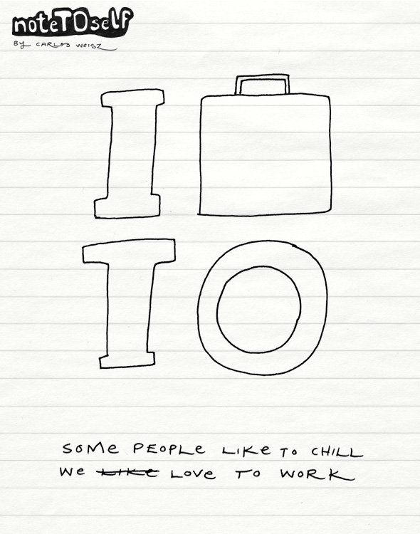
 CONCEPT:
STRATEGY: Since we admire NYC so much and all we want to do is be like them, why not just rip their logo with a twist. Why not be proud of what we do best, being workaholics!
OPPORTUNITY: Business people will be so proud that someone thought of them, that they will donate lots of cash to all charities, organizations and non-profits in the city. It's just a win-win situation really, sort of like doing an inner expansion plan (take that Barcelona!)
NOTE TO DESIGNER: Make sure the icon looks like a briefcase and not a luggage bag. Colours always gray for the briefcase and the letters can be different colours so people feel like they have a choice, cuz that how we roll in this city.
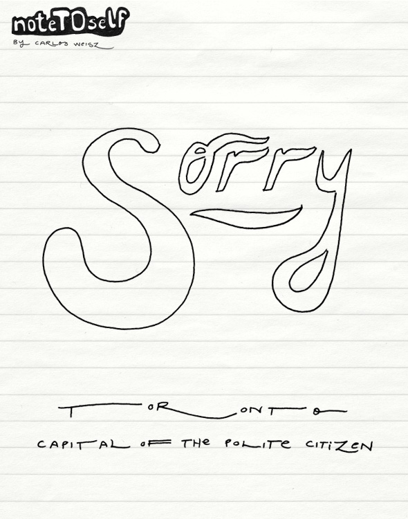
 CONCEPT: We are Sorry Toronto is the Capital of the Polite Citizen
STRATEGY: Sorry, I hope no one is offended by this one... I just wanted to make sure everyone is OK with this branding idea. If not, i can get rid of it, seriously, just think about it. If you think it's not working that's fine I'll just remove it. I hope I didn't make you waste time considering this one. I would be devastated to know someone misunderstood what I was trying to say.
OPPORTUNITY: There is really no opportunity on this one. We would be so passive and nice about it that it would only show up in the TTC AD space.
NOTE TO DESIGNER: Make sure you don't work too hard on this one. Leave it black and white as we don't want to offend anyone by choosing a colour they don't like.
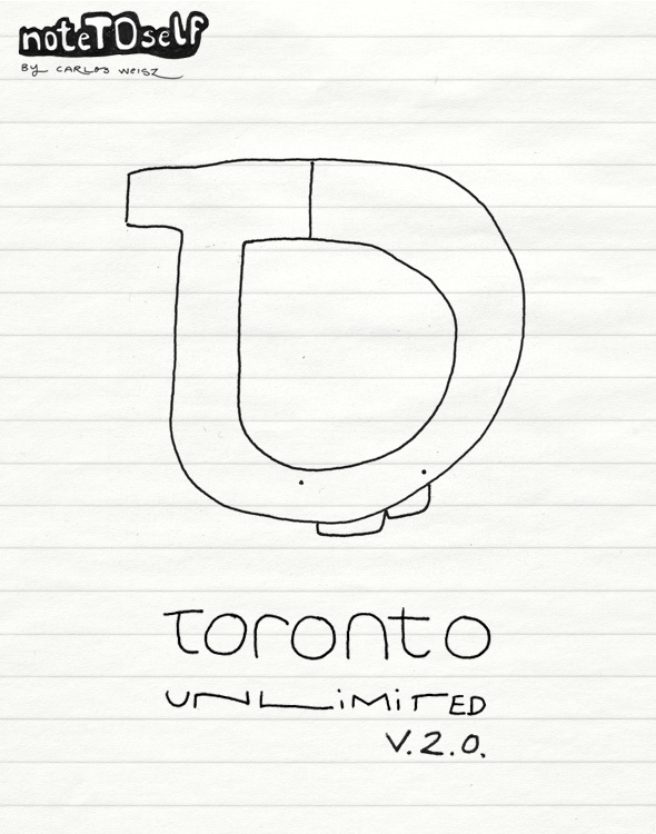
 CONCEPT: Toronto Unlimited
STRATEGY: In these hard economic times, why spend another $4mill when we can re-use. Plus it's all about the 2.0 these days.
OPPORTUNITY:This identity was so lame that now it has become uber-cool. We already have all the research on saying that it works, so why not give it another try. Plus, I really doubt anyone even noticed it the first time.
NOTE TO DESIGNER: Download the EPS files form some X blog and use neon type of colours or some crazy pattern texture for it.
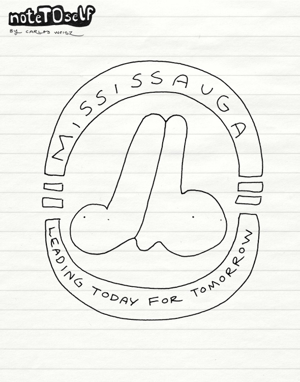
 CONCEPT: Mississauga, Leading Today For Tomorrow
STRATEGY: Why try to fix it when we can take over. I think Mississauga have their shit more put together than Toronto, so let's just forget about the whole Toronto thing and re-brand as Mississauga.
OPPORTUNITY: Think about all the job opportunities that would be created by changing the name of the city, plus merch, plus legal systems... if you ask me this idea is pure Gold!
NOTE TO DESIGNER: Make the M look like the Montreal Expos M. As for colour, use green - it will look good in the international scope.
Latest Videos
Latest Videos
Join the conversation Load comments


