
What the new platform at Union Station looks like
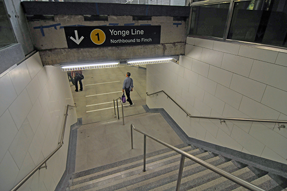
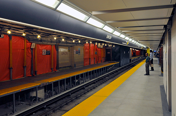
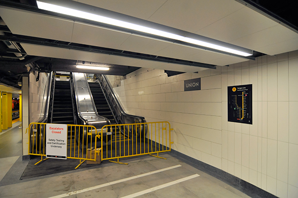
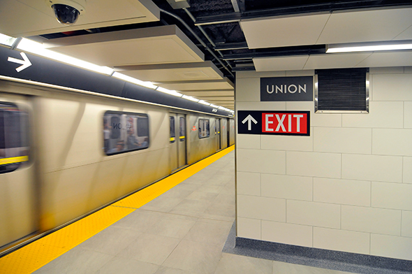
This morning was a whole lot different for TTC passengers using Union Station. As reported last Wednesday, the second platform was unveiled to start the work week, and it immediately helped to ease congestion at the transit hub. There's twice the space now, with those headed north to Finch enjoying the brand new boarding area. There was some confusion when many riders first exited trains in the morning, but it was short lived, and there were a lot of staff on hand to provide direction.
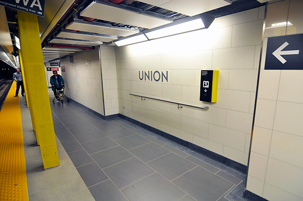
Overall, the new platform looks great -- and for $137 million it should. But it's worth noting that there are some rather narrow sections in the middle where the standing area is only about 10-12ft wide. This poses a bit of an issue when the station is packed, but is easily solved by funnelling riders to the wider areas at the ends.
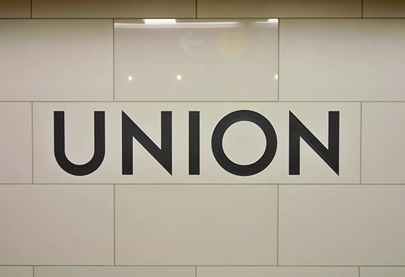
One note about aesthetics. Even though there's still lots of construction in progress around the new platform, I have to say that the TTC did a good job on making this appealing to the eye. The signage is plentiful, the Toronto Subway font looks great (as usual), and the station feels immediately much more modern.
MORE PHOTOS
Latest Videos
Latest Videos
Join the conversation Load comments


