What Toronto beer has the best looking label?
The label on the Toronto beer you're drinking is more than just something to peel when you're bored or sexually frustrated. Instead, they're mini pieces of art, designed with a purpose and with a little story to tell. There's noting necessarily wrong with minimalist logos that feature basic graphics â so long as what's inside the bottle or can is interesting â but there's also something nice about a label that's been crafted with extra care. Here are my picks for the best looking labels from Toronto breweries. Weigh in with your selections in the comments.
Great Lakes Brewing Company
The artwork for GLB's experimental Tank Ten series, which is currently enjoying some success in LCBOs, was drawn by Garnet Gerry, designed by GLB-friend and Danforth drinks guru Fabian Skidmore and, according to Great Lakes, was based on ideas from "the talented beer-soaked brain of brewmaster Mike Lackey (with a little help from his GLB minions)."
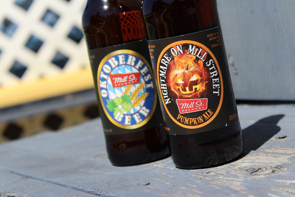
Mill Street Brewery
Mill Street's art is created conjunction with the Mill Street's Marketing Department, who work with designers to craft designs best suited the individual brands. The art for the two beers available in their upcoming Harvest Pack, for example, was created by Walter Leipurts of WL Designs, who was formerly an art director at Molson and designer at Carling O'Keefe.
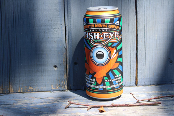
Kensington Brewing Comapny
KBCo's eye-catching artwork on their Augusta Ale, FishEye PA and Watermelon Wheat cans was created by founder Brock Shepherd in conjunction with Seth Rowanwood from Inklight. Says Shepherd, "People shop with their eyes so I wanted something that would really pop and jump off the shelf, which I think we can agree is achieved."
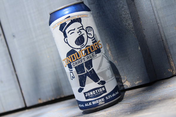
Junction Craft Brewing
In addition to all their branding, the iconic little conductor that adorns Conductor's Craft was designed by David Hayes, who, having collaborated on Steam Whistle's logo and designed the Wellington brewery art, is no stranger to beer branding. The streetscape in the background is actually based on archival photos of the Junction.
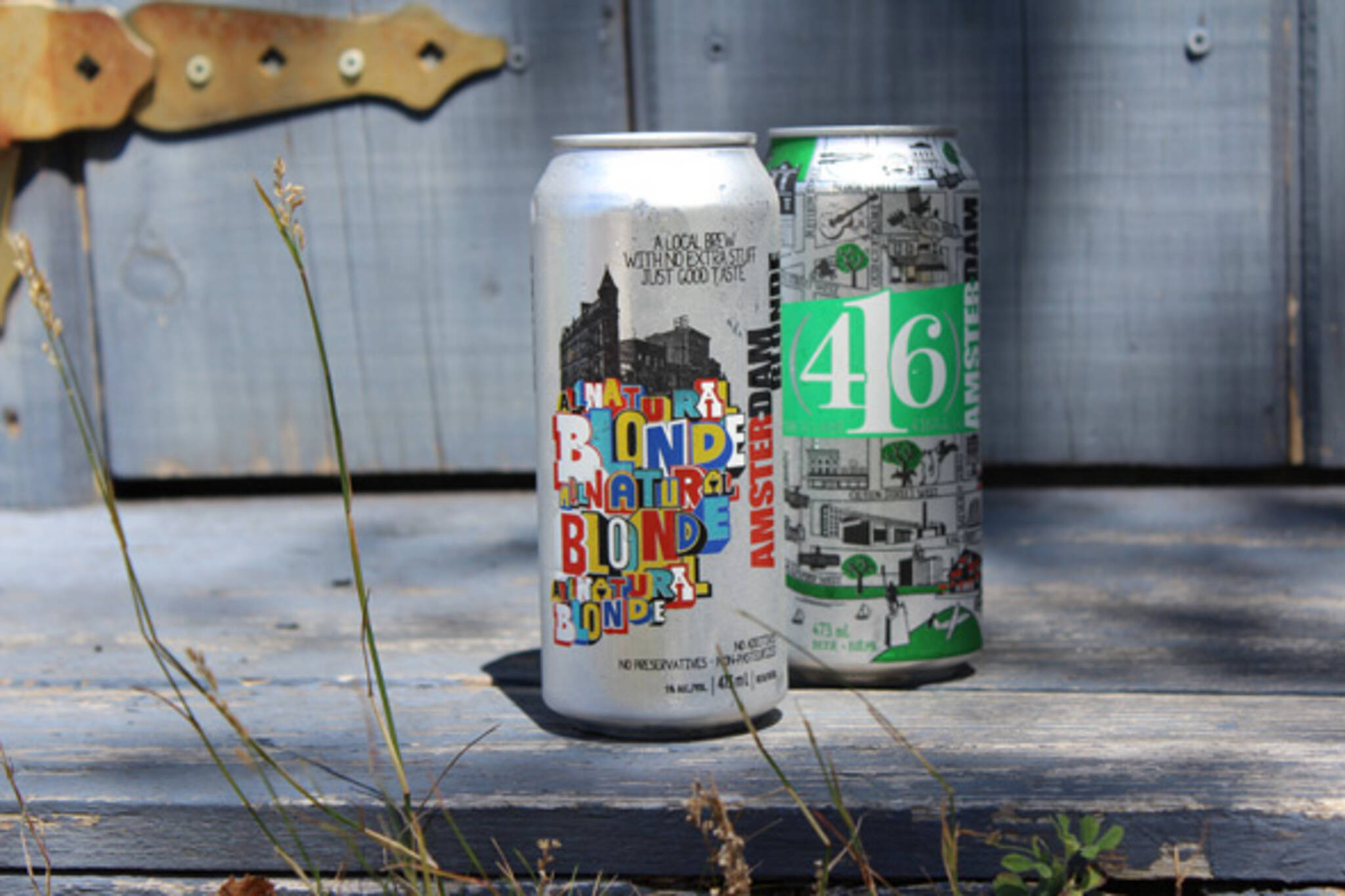
Amsterdam
The idea behind Amsterdam's recent rebranding of these two beers was to celebrate Toronto's character. For Amsterdam Blonde, they worked with a design agency and Greg Lamarche, an artist known for his typography designs. 416 Local Lager's look was designed by Canadian illustration artist, Ian Philips who incorporated Toronto streets, neighbourhoods, and landmarks.
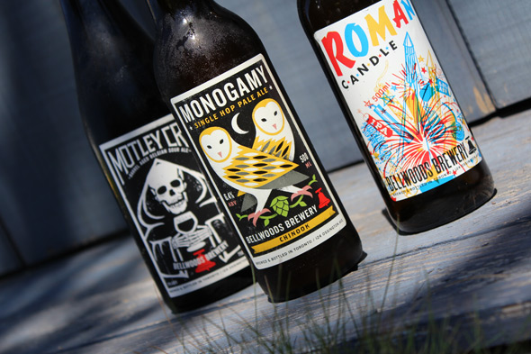
Bellwoods Brewery
The poster-friendly label designs of Bellwoods are the work of the design brother duo Doublenaut--with the notable exception that the "witchshark" that adorns that eponymous famous beer was illustrated by local artist Kate Wakely-Mulroney, based on a 2011 Witchshark sighting.
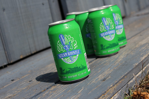
Steamwhistle
Steamwhislte's logo was meant to invoke the quittin' time sound of a whistle (the inspiration for their company name) and was influenced by 1950s painted-label bottles. The logo was a result of a collaboration from Dave Hayes as well as Bill Grigsby of Reactor Art and Design. Interestingly, the design was once swiped by a Glendale, Pennsylvania cafe.
Photos by Ben Johnson
Latest Videos
Latest Videos
Join the conversation Load comments