Here's what Toronto's transit map will look like in the 2030s
With several rapid transit lines in varying stages of planning and construction, Toronto and the surrounding GTA region will witness a substantial boom in connectivity in the coming decade, and it can be a lot to keep track of.
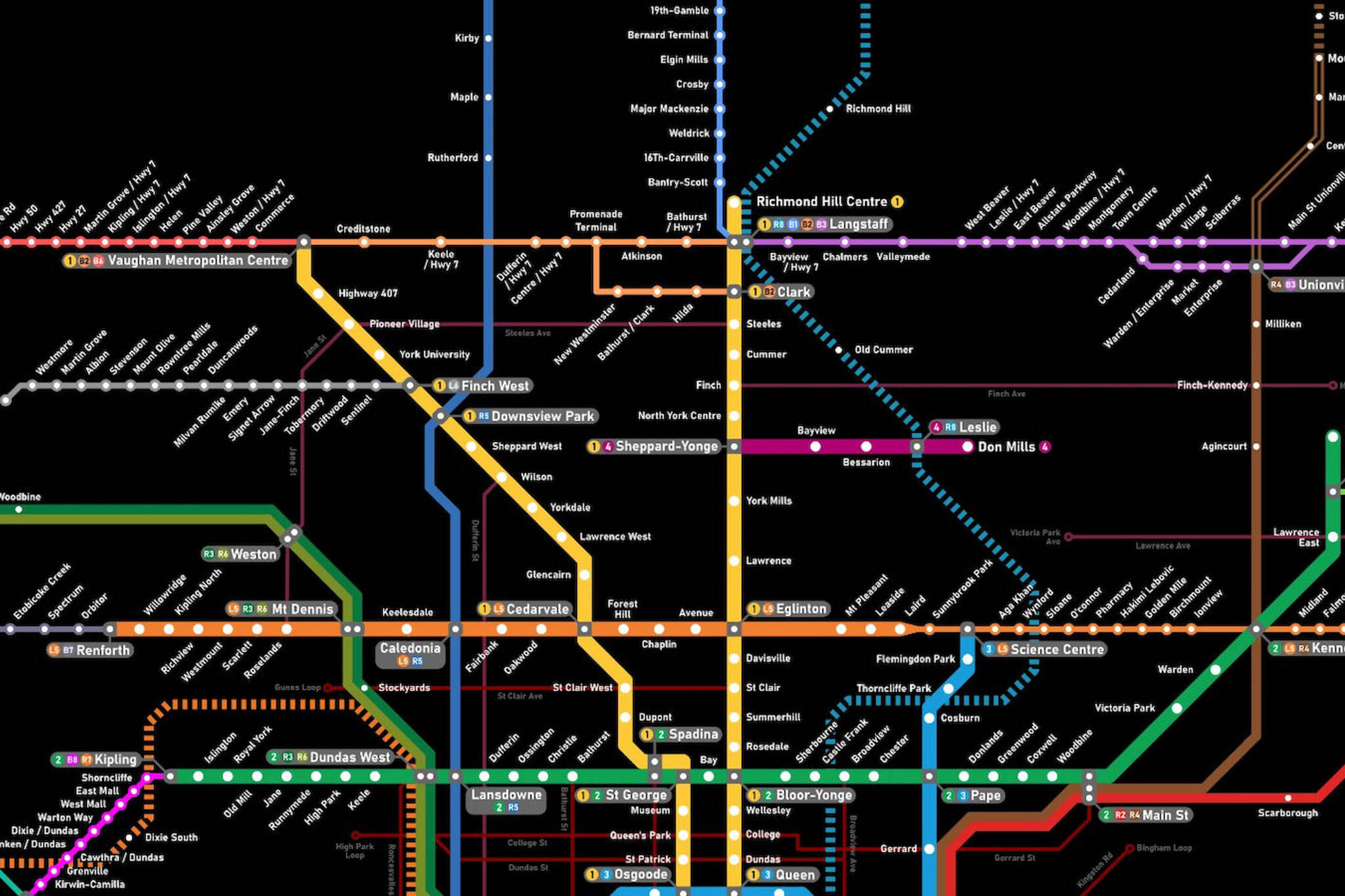
But one dedicated railfan is making Metrolinx's job just a bit easier with their own unique creation, building out a detailed map that offers a sneak peek at how commuters will get around the region in the 2030s.
August Pantitlán, a Toronto university student and transit fan, was inspired to create this comprehensive rapid transit diagram as part of a mapping competition held by Toronto-based Youtube channel RMTransit, telling blogTO the channel is among the voices who inspired this passion for transit in the GTA.
After the competition concluded, Pantitlán didn't give up on the creation, saying the next step was to continue "working on the map for my own vision of a unified rapid transit map that consolidates every major project under construction or in advanced planning."
It's been taking shape bit by bit since September, Pantitlán pausing for school along the way and resuming this winter, dedicating over six hours to laying out the map just right. And no fancy tools of the trade were used, instead turning to free software Inkscape to bring the diagram to life.
final version of my Toronto-area integrated rapid transit diagram that includes everything that is existing, under construction or in advanced planning with construction start expected in the next few years
— august (@augustAP12) December 30, 2021
thx to everyone who gave feedback and tips to help refine it :) pic.twitter.com/m4jYArYZNq
The map has evolved along the way, and Pantitlán says that there's still more work to do. After releasing what was intended to be the final version, Pantitlán tells us that "many people reached out to let me know of some additional projects or changes that I was not aware of."
Metrolinx does have a regional map of its own showing the network as it will appear in 2030, though this look into the future is heavily simplified, while Pantitlán's map specifies the dozens of individual lines and hundreds of stations that will serve the region in the future.
Of course, visualizing such a complex network wasn't always so black and white, with lines like the Eglinton Crosstown (future Line 5) operating in a hazy middle ground between subway and surface transit.
For this reason, the map shows that line bolded (like heavy rail subway lines) for underground/elevated stretches and a thin line for sections that operate at street level with less-frequent train service.
And it's not an arbitrary distinction, Pantitlán saying that it was"very important to show the difference in service levels as this will be noticeable by commuters when the line opens in 2023."
"Commuters should know that this difference exists and that Line 5 is not a consistent service experience end-to-end as the official 2023 TTC map would suggest."
Pantitlán suggests that Metrolinx should implement a diagram like this, believing "it would be very useful for commuters to have a diagram that shows every rapid transit line in the region whether it be bus rapid transit, LRT, subway, or GO train."
In doing so, Pantitlán says Metrolinx would allow transit riders to "trace their route across the entire region, from London to Bowmanville, or Niagara Falls to Barrie!"
August Pantitlán
Latest Videos
Latest Videos
Join the conversation Load comments


