
What the $100M Manulife Centre revamp will look like
The Manulife Centre is getting a massive facelift, one that will pave the way for Toronto's first Eataly location. It's the latter news that's made all the headlines since it was confirmed that the Italian marketplace and eatery is landing at Bay and Bloor in 2019, but the bigger picture is intriguing too, especially as pertains to all the changes slated for the immediate area.
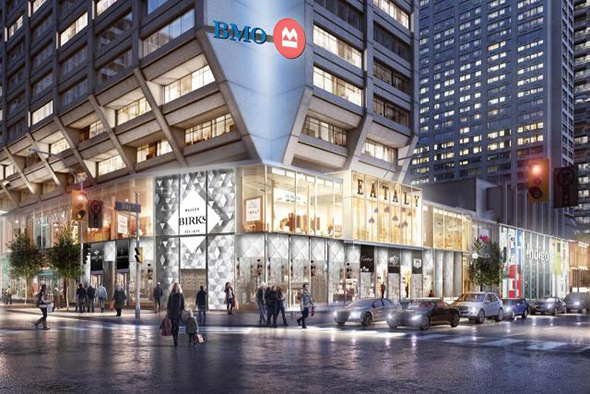
The $100 million facelift will completely transform the relationship of the building to the street, adding a retail presence to Bay and Bloor that is currently set back from the intersection. Toronto architecture buffs will likely have mixed feelings about this. Even if the style has fallen out of favour, the Manulife Centre has always been one of the city's best examples of Brutalism.
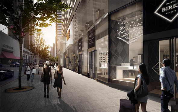
In fact, the most defining feature of the building -- aside from all of that concrete -- is the way in which the upper tower furls out from the podium. It's quite the opposite of the way that the podium/tower relationship is typically articulated these days, and also a tribute to the strength of the building materials.
This will be somewhat diminished now, but the immediate streetscape will also be enlivened. In that sense, it will be a key part of the new Yorkville that's starting to take shape.
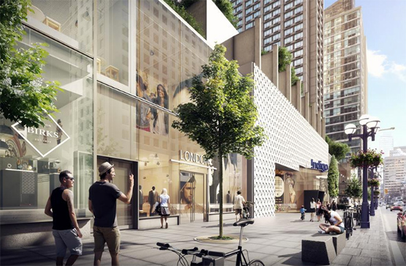
The Manulife Centre has never suffered from the problems that the Eaton Centre had when it was first plopped down on Yonge Street. The new glass base, designed by B+H and MdeAS Architects will bring retail closer to the sidewalk and help to unify the rapidly intensifying Mink Mile.
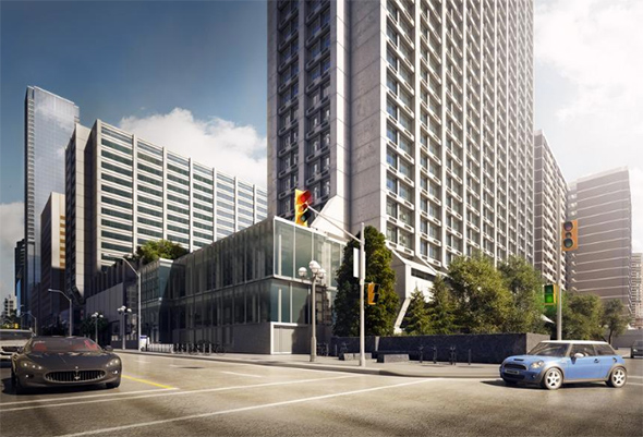
The space surrounding the Manulife Centre has never been particularly well used, and it often felt like a wind tunnel in the fall and winter, so there's a lot to like about the early plans for the facelift. There's no word about new retailers aside from Eataly, but you can bet that the extra space it provides will bring additional stores as well.
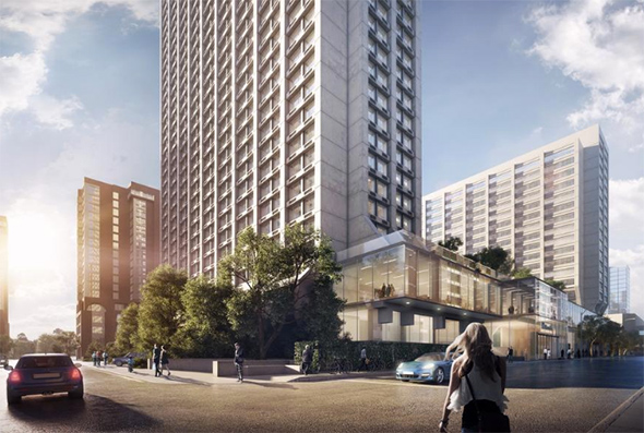
Renderings via Manulife Real Estate and B+H.
Latest Videos
Latest Videos
Join the conversation Load comments


