
Frank Gehry unveils new designs for King West towers
Frank Gehry's triptych towers planned for the Princess of Wales Theatre block have received their first major tweaks since being unveiled last October. The "sculptures that people can live in," to use the words of Gehry himself, now feature a wafting, "cloud-like" podium and far more exterior detail than the previous iteration.
The first concept, which Gehry said would change during his speech at the unveiling, has given way to some impressive visual refinements but the modifications do not address the main concerns the city expressed in its preliminary report released back in February, namely the height and loss of historic buildings.
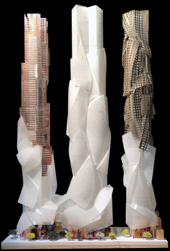
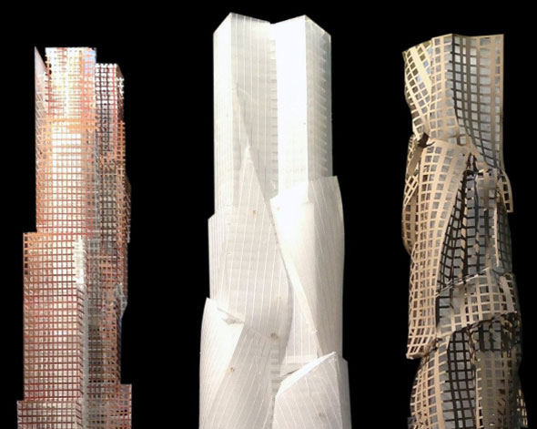
The latest concept appears to follow the lines of a secondary model unveiled with the original designs in October 2012. The east tower, planned for the other side of Ed Mirvish Way, is the most striking. An apparent relative of Gehry's warped and rippled 8 Spruce Street in New York City, though I'm told it's not intentional, the exterior cladding appears cut in pieces and draped off the tower.
Speaking with the Toronto Star's Christopher Hume, Gehry partner Craig Webb said the "cloud-like" podium that drifts halfway up all three of the towers is meant to convey "something silky and soft" and provide a sense of "lightness." The first version had something resembling torn strips of paper at the base.
The city has expressed concerns over the height of the towers and wants to see each one trimmed by around 30 floors. All three are currently over 80 stories. The loss of several heritage warehouses, a throwback to the days when this part of King West was a manufacturing district, is also a worry.
"We haven't modified the heights and we are hoping not to," says Peter Kofman, President of Projectcore Inc., the development management company behind the Mirvish+Gehry project.
"We really don't want these towers to be down at the level of adjacent buildings - we really want to create these iconic towers and have them stand out and have an expression against the skyline that's dramatic. We don't want to disappear behind other buildings here."
"I think the dialogue with the city has allowed us to take a particular direction and do things that are slightly different than they were previously."
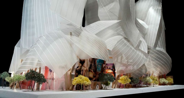
The white veil around the podium is made of glass and supported by wooden beams that are meant to evoke the historic interiors of the Eclipse White Wear and Anderson warehouse buildings that would be demolished were the project to proceed as-is. Despite the exterior developments, things are "very close" to the original inside.
"It's an evolving story and it's an interesting opportunity to create some great architecture and design" says Kofman. "It's a process, and we're hoping at the end of the day we've created the best thing we can create given the opportunities and constraints."
MORE IMAGES:
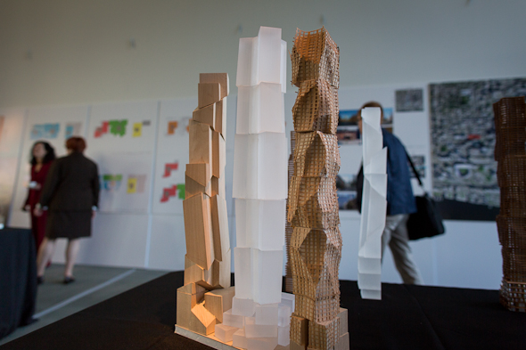
The wooden model from the unveiling that the designs appear to closely match.
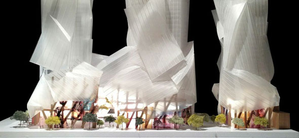
An alternative close-up view of the wood and glass podium.
Chris Bateman is a staff writer at blogTO. Follow him on Twitter at @chrisbateman.
Image: Tom Ryaboi, Mirvish+Gehry, Projectcore Inc.
Latest Videos
Latest Videos
Join the conversation Load comments


