AGO's New Logo: Yay or Nay?
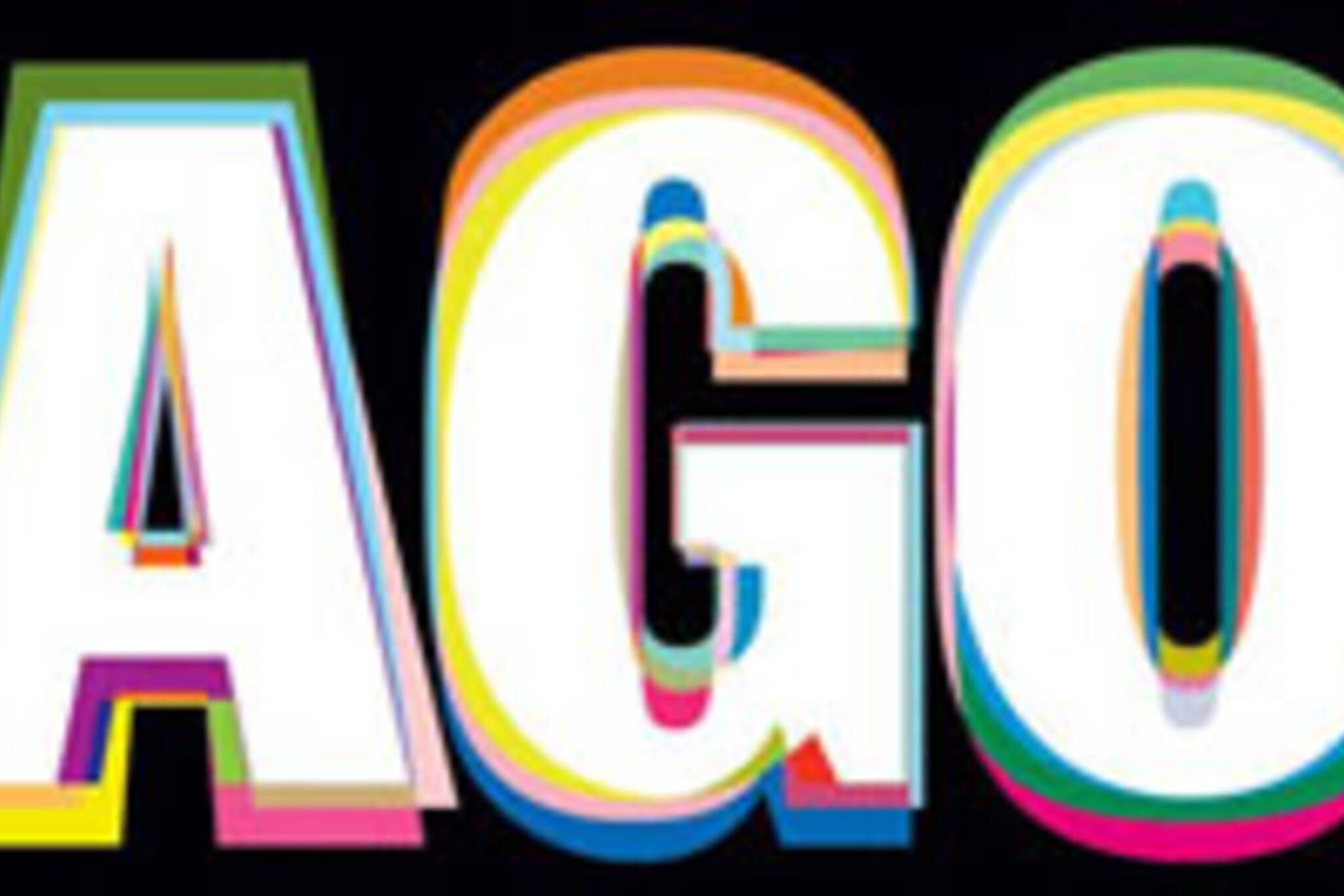
The AGO has a new logo, and this ... is it. Done by Toronto design overlord Bruce Mau, the new logo is -- well, to be honest, looking at it on the computer monitor like this is kind of giving me a headache. Or making me feel like I'm wearing those red and blue 3D glasses. I'm curious to see how it'll look when it's 100x this size.
Other than the cross-eyed feeling though, I kind of like this -- I think it's simple, but still interesting. Plus, in a year it's going to be so ubiquitous that we won't even remember what the old logo looked like. (Though if you're interested, here's a kind of neat logo retrospective that the AGO put together. I'm really liking the classiness of the 70s. (There's a sentence I never thought I'd type.))
Anyway, I think introducing a new logo is one of the hardest things you can do, as a brand. I can't remember a time in my life that a major company or organization has introduced a new logo that hasn't been met with heaps of criticism. Logos are hard: they're expected to both stand out and to fit in, to have the power of instant recognition but also longevity. That's a pretty tall order.
So I'm curious to hear what you all think -- yay or nay on the new logo?
Latest Videos
Latest Videos
Join the conversation Load comments


