
Come Up To My Room 2008
The 5th annual Come Up To My Room artistic design event took place over the weekend at The Gladstone Hotel. The event featured works by artists from various disciplines who were chosen by the curators Pamila Matharu and Christina Zeidler. Once the artists were chosen, they are free of any barriers to creativity and had complete control over their projects. Even the curators weren't allowed to see the exhibits until opening day.
There were 12 installations this year, and 11 public space projects. Installations were housed on the 2nd floor in various rooms and the public space projects were in various places on the 1st and 2nd floors. Attending the press preview allowed me to spend some time talking to each artist and to get an appreciation of their spaces without a lot of people in the way.
Continue reading for my thoughts on of many of the projects featured this year, with accompanying visuals courtesy of blogTO photographer Mike Rotenberg.
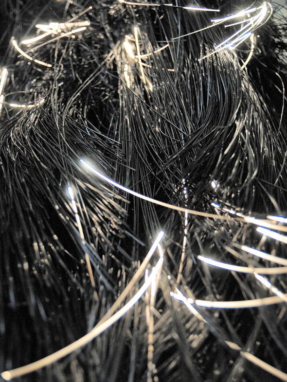
My first stop was Room 206 by Jacques Bilodeau, an artist and architect from Montreal. I was drawn to the room because of this big black hairy looking sculpture that reached up to the ceiling, surrounded by a large black mass that had been twisted and contorted. Upon closer inspection the black mass wasn't made of cloth fiber but of optical fibre. There were some parts of the fibers that weren't completely black and emitted light, which resulted in a subtle glow.
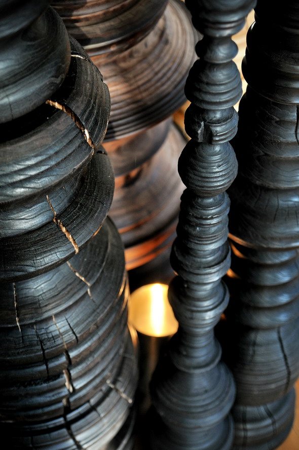
Room 207 by Dennis Lim was all about him evaluating his 5 years of design work. It consisted of 3 groups of work. The first was a bunch of floor to ceiling wood sculptures produced on a lathe. They looked like extra large candle holder or bedposts. The wood as all dead wood recovered from Parks & Rec. They dump all the dead trees they collect at the lake and many of the woodworkers in-the-know make their way down there for materials. They were beautiful. Next were two mobiles; one made of wood and one of metal. The metal one had a candle underneath to add an element of reflecting light. Unfortunately, I was there during the day and the effect couldn't be seen very well. Dennis mentioned that he was thinking of blaocking out the windows so the effect could be seen during the day as well. Lastly, one of the walls was covered in concrete numbers from 1 - 5, which again represented his 5 years in design. Visitors were encouraged to take a number with them as he had a extras in the room for the weekend. I took the number 1.
Room 208 was by Pietro Gagliano and Peter Wehrspann, who decided to create a dialogue about consumerism through their art. Peter is the designer, metalworker and woodworker. Pietro is the graphic designer. Together they created chairs and tables covered in messages about consumerism. They created a table in which a design was incorporated into the finish. This design also carried the words "I am homegrown", which describes the origin of the locally sourced wood.
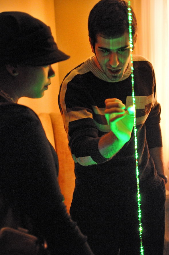
Room 209 by Bruno Billio and Mahan Javadi was a lot of fun. It consisted of two laser lights flowing from floor to ceiling. If you looked closer you would notice that the laser was guided along strings. The designers explained to me that this was to be an interactive laser display. The string was treated with fluorescent dye in order to have the laser reflect off the filaments of the string. I could see a lot of possibilities for their creation especially in the decor world.
The main room of the 2nd floor had a mini installation set up. Eric Chen is a graphic designer and his designs covered one wall of the floor as did Adrianne Rubinstein's work based on bees and honeycombs. By the balcony was a beautiful wood chandelier by Clayton McMaster and a large chair by Martin Rosen that reminded me of a very fashionable throne. Tahir Mahmood showed the prototype of his interactive entertainment center. One of my favourite works in this area was ReThink? by Covello Reesor. They reworked compact florescence bulbs into different shapes. This was done with the help of a glassblower. The original electricals from the bulbs were used and the new glass added.
Room 209 was The Souvenir Shop and I was very disspointed that I couldn't buy anything during the press preview. I spotted scarves printed with The Bay and CN's logos. They were obscured enough that you had to look really close to actually understand what the prints are. The shop carries a lot of Canadian influenced products handmade by Canadians. The brains behind the operation are the same folks that created the great design website, Canadian Design Resource..
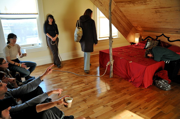
Room 214 by This is Collective had the theme of capturing prey. There was a bed in the middle of the room covered by a propped up box with a large tree branch on a rope (just like one of those traps you would see on Bugs Bunny). The bed was the bait and it contained 12 peep holes were you could look in and see each artist's idea of bait. The dioramas ranged from the dance scene in Saturday Night Fever to little dolls killing each other.
Room 213 by Magic Pony was about Eastern European crafting. The artists used tradition crafts and bring it to modern times. The major influence this time was Ukrainian eggs. As with most Magic Pony installations, birds were present. The installation is now in the Magic Pony store on Queen West if you wish to check it out in person.
Room 211 by DB Johnson was my favourite of the bunch. He created the ultimate ddult playground, and no, it's not porngraphic. Any outdoor nut will love this room. Influenced by birds and surrounded by feathers, he created a large bunk bed in the image of a bird's nest. Underneath was a little lounge to chill out in. The smell in the room even reminded me of the outdoors. Making the cabin look complete was the addition of heirloom item like you would see in a rustic cabin. DB, a carpenter, mentioned to me that his idea was to create a room that an animal-human hybrid would live in. I'm not a hybrid but I would love to have this room at my place.
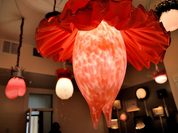
Room 204 by Heather Nicol was an installation of light and textiles. She was the only person I really gushed over because I'm a fan of her work. I saw her installation at the AGO Massive Party last year and I was hooked. It consisted of a group of dresses that were illuminated and hung from the ceiling. This installation consisted of 3 parts. In the washroom was something that looked like a giant textile gramophone including music. On one wall was a series of textile art work in frames which all incorporated light either within the textile work itself and through the lights attached to the frames. All the lights in the room dimmed and returned to full strength on a pattern I couldn't make out. My favourite part of this installation was the large single lamp chandeliers that incorporated fabric and glass. Heather explained that she things of her installations as a group of individuals having a conversation with each other.
Room 205 by Jeremy Cox and Lucas Brancalion consisted of a large wood and a large metal sculpture hanging from the ceiling. The metal structure looked like honeycombs. The wood sculpture had an interesting story as it was put together on the premises and took about 14 hours to complete. The light and shadow played together in the room and changed with different lighting conditions.
Room 202 by Patty Johnson was a showcase for her NorthSouth Project which I learned about last year at CUTMR. A large table in the center of the room displayed the products created by craftspeople using sustainable and fair practices that benefit all individuals in the process.
Finally Room 201 by The Brothers Dressler was based on the concept of the shoe last. This is something I could get into. The last is the most important part of shoe design. Without a good last, you will have an inferior shoe. They used the last in different ways incorporating them into table legs, lamps, bookshelves and door stops. There was also an incredibly comfortable reclining chair in the room and I could have curled up on it and fell asleep. I find it funny that years later I'm running into the Dresslers again. I used to do scorekeeping for York University basketball and I would see them playing for UofT. Toronto is such a small town and eventually people will return to your life again.
I've missed seeing some public space project people and I apologize to them. Next year I will try to be a little more observant.
Not large enough? See this slideshow fullscreen.
Latest Videos
Latest Videos
Join the conversation Load comments


