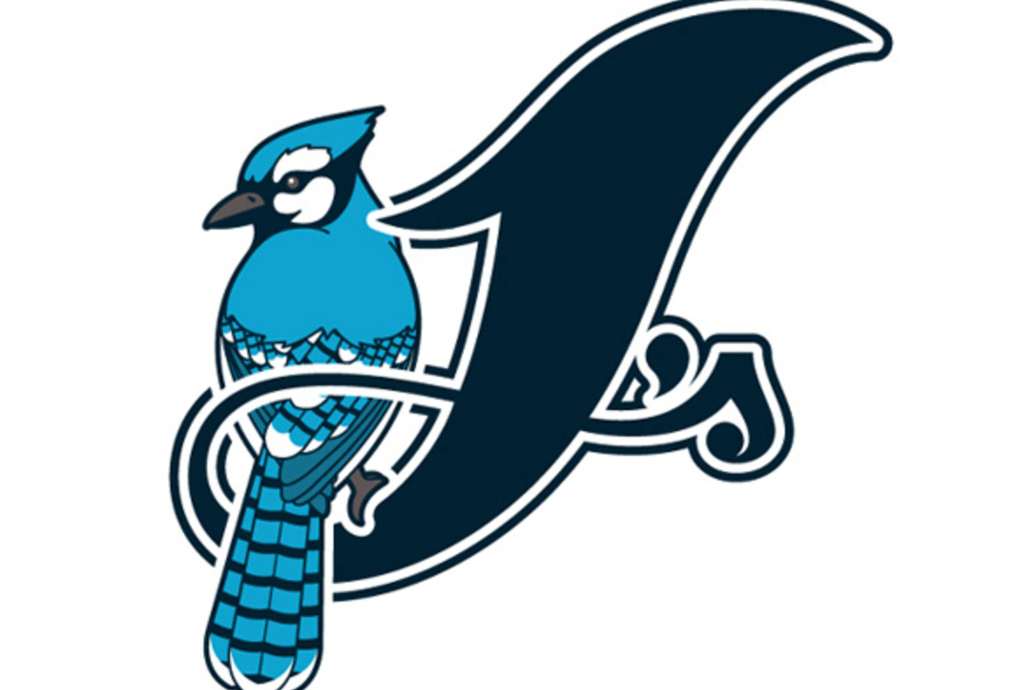
What do you think of this redesigned Blue Jays logo?
The Blue Jays might be enjoying the off season right now (with the exception perhaps of GM Alex Anthopoulos, who's dealing with trade rumours galore), but that hasn't stopped a few local designers from re-imagining the team's logo. We've posted about a new-look Jays logo before, but that version sought to make minor improvements to the existing team iconography rather than wholesale changes. This version, on the other hand, goes for broke. The work of Steve Preisman, Jason Yurichuk and Patrick Lo, the above effort takes inspiration from Preisman's three favourite Major League Baseball logos in the form of the Detroit Tigers (circa mid '90s), the Oakland As and the St. Louis Cardinals. Traditionalists might not love the prominence of the J in this mock redesign, but it 's definitely catching.
The Jays aren't about to make a change (they released their current logo just two years ago), so this exercise is just for fun. But what do you think of the redesign? The designers hope to make hats with this logo eventually. Would you buy one?

Canada Day Edition

CMYK on colour background
Latest Videos
Latest Videos
Join the conversation Load comments


