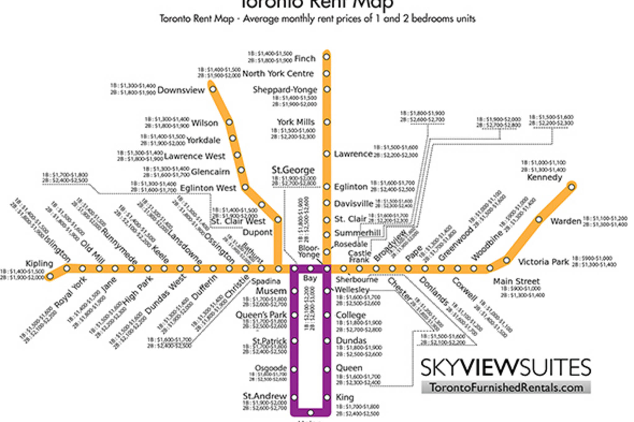
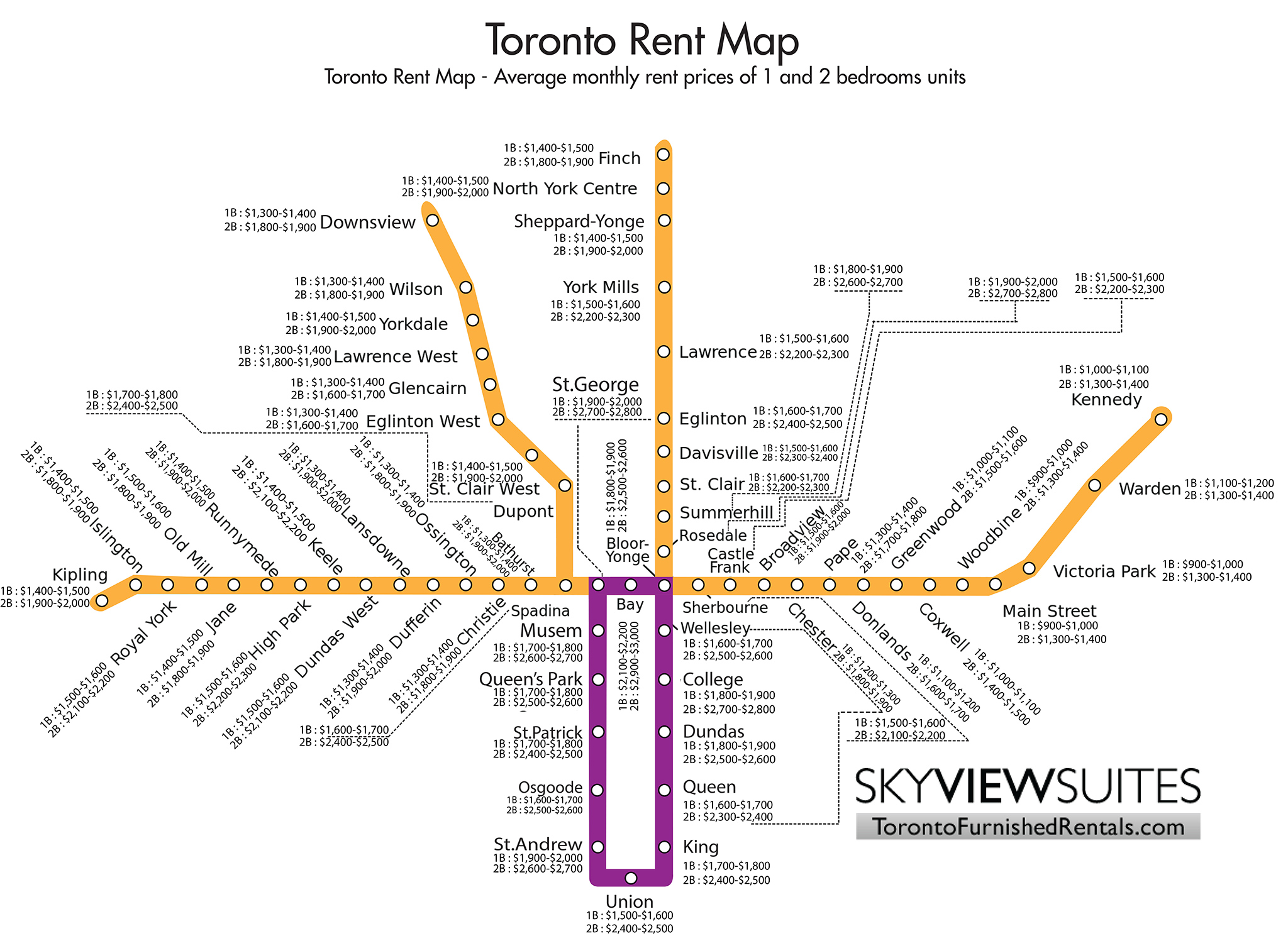
Map charts Toronto rent by TTC subway stop
Ever wondered what the cheapest neighbourhood for rent is near the subway line? This new subway/rent map of Toronto (high res version here) should help apartment hunters narrow their search.
Compiled by Sky View Suites, the overview of rental rates in this city is adequately scary, though the numbers are inflated due to what I might call a condo bias. By prioritizing these units in the composition of the map, the prices per stop tend to be higher than what you'd get if you factored in basement and bachelor units in sub-divided residential homes.
In other words, it's best to take these numbers with a grain of salt. It's better to use this map to track the way that rental rates shift from stop to stop than it is as a guide to the cost of renting in general. The average price of a one-bedroom at Lawrence West, for instance, is high at $1,300. Yet, it's interesting to note that Dufferin and Lansdowne stations are ranked the same.
I'm not sure that there are any major surprises here in terms of trends, but it's an exercise that's sure to pique some curiosity. Read it and weep, Toronto.
For more info see this article.
Latest Videos
Latest Videos
Join the conversation Load comments


