What Toronto's highways would look like as a TTC map
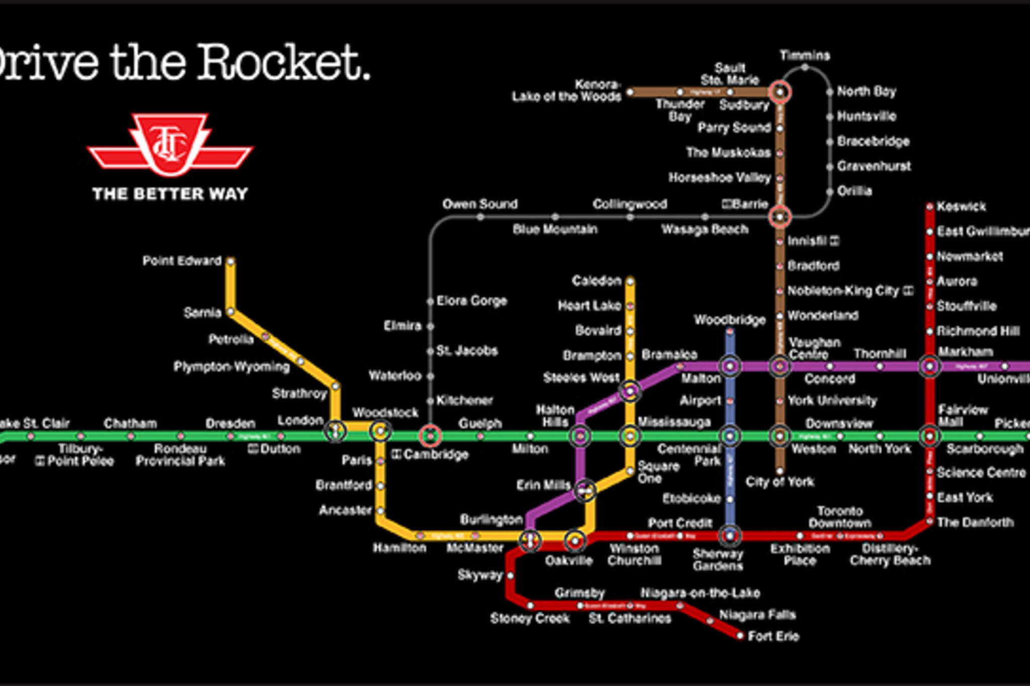
Toronto's TTC map has inspired numerous artworks, from fantastical renderings that predict an optimistic and more connected future for our city to a Jimmy Choo version that costs more than $1000. The latest such interpretation show us what Ontario's highways would look like if plotted on the transit grid.
Created by engineer Sassan Sanei, the map features the 401 as the focal point; it replaces the Bloor-Danforth line. The Yonge-University-Spadina line is a combination of the 402, 403 and 410 and the Scarborough Line stretches all the way to Ottawa.
"Highway 407 ETR, in purple, resembles the Sheppard subway line," writes Sanei in a blog post, "as it carves a path eastward only to end abruptly, well short of many travelers' destinations."
Sanei took many creative liberties with his project, such as including a monorail line that runs from Cambridge up to Barrie. While the map plots the province's highways (both real and imagined), I can't help but to think of the possibilities if we actually had a subway system that looked like this.
Check out a high resolution version of the map here.
What do you think of this TTC highways map? Let us know in the comments.
Latest Videos
Latest Videos
Join the conversation Load comments


