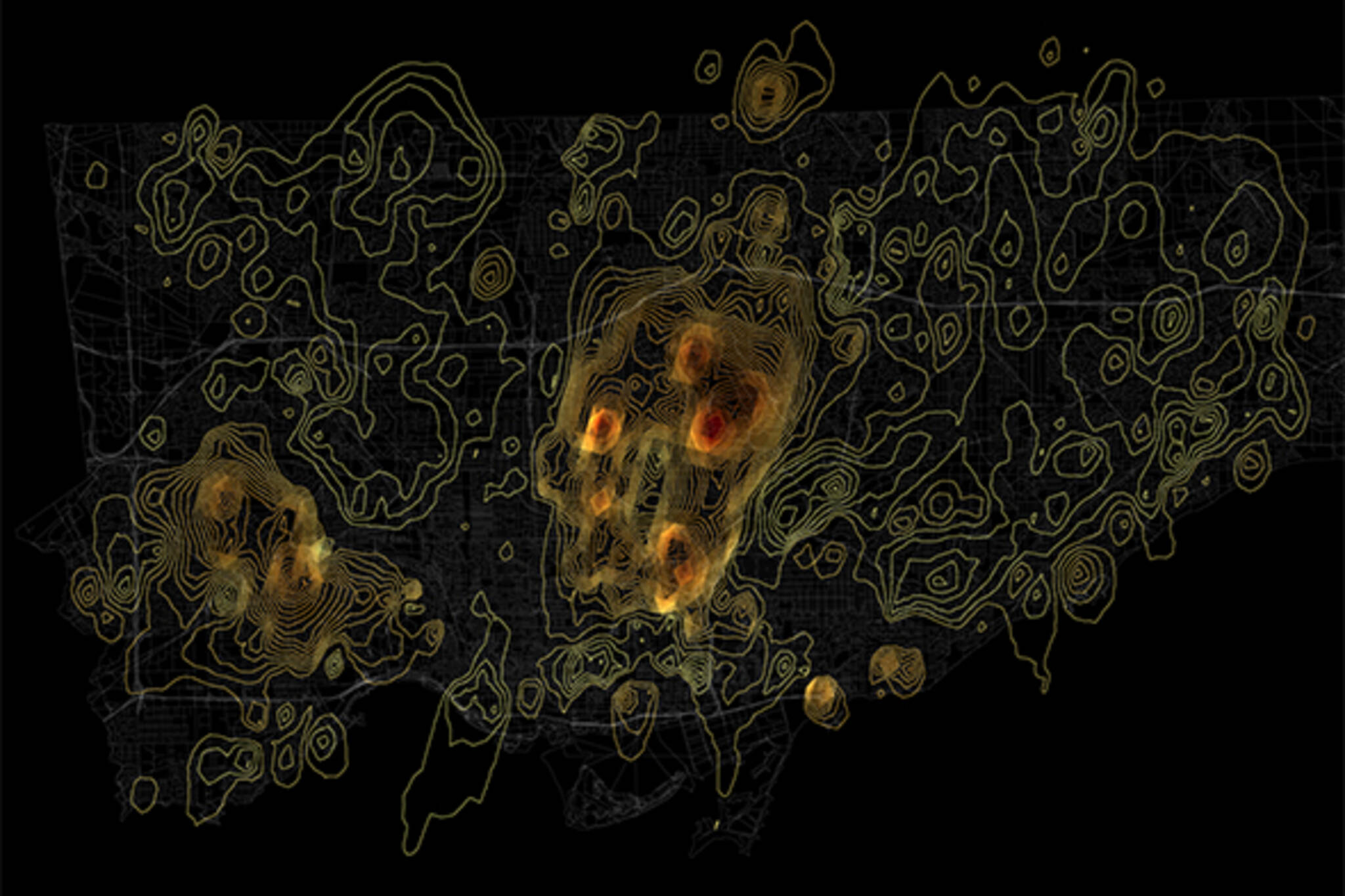
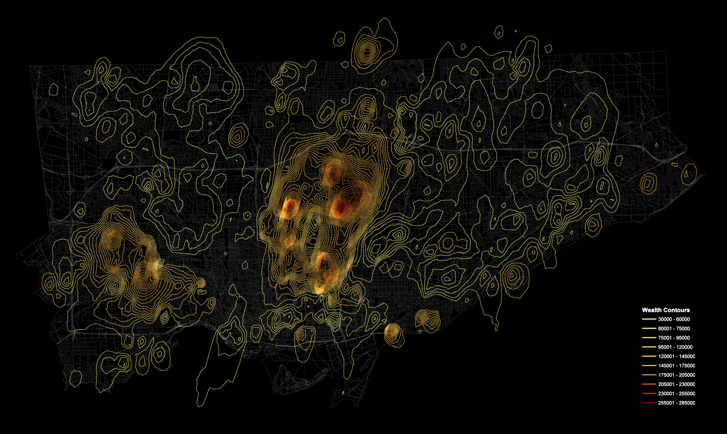
New map charts Toronto wealth as peaks and valleys
Those who follow our regular map-based posts will know that one of Toronto's most creative digital cartographers is William Davis. Along with some slick work on Toronto neighbourhoods, he's also started to put together unique maps of of the city that are as much graphic art as they are cartography. Just check out this map of every traffic signal in Toronto for proof of this intriguing combination.
Davis' latest work also fits this bill. In it, he plots the dispersion of wealth across Toronto as peaks and valleys. Unlike many creative maps of Toronto, this one is difficult to recognize until you have a few cues, but once you get your bearings, the distribution looks very familiar.
Wealthy neighbourhoods like Forest Hill, Lawrence Park, and the Bridle Path are all easy to pick out, while sharp contrasts like the one between Rosedale and St. James Town are dramatically highlighted by the map. I'm not sure how scientifically useful this method of plotting demographic information is, but it's certainly an unfamiliar way of looking at Toronto. And when we examine things without the baggage of familiarity, we're often at our most critical.
Have a look at a bigger version of the map to see if there's anything to learn here.
Latest Videos
Latest Videos
Join the conversation Load comments


