What do you think of Pearson's new logo?
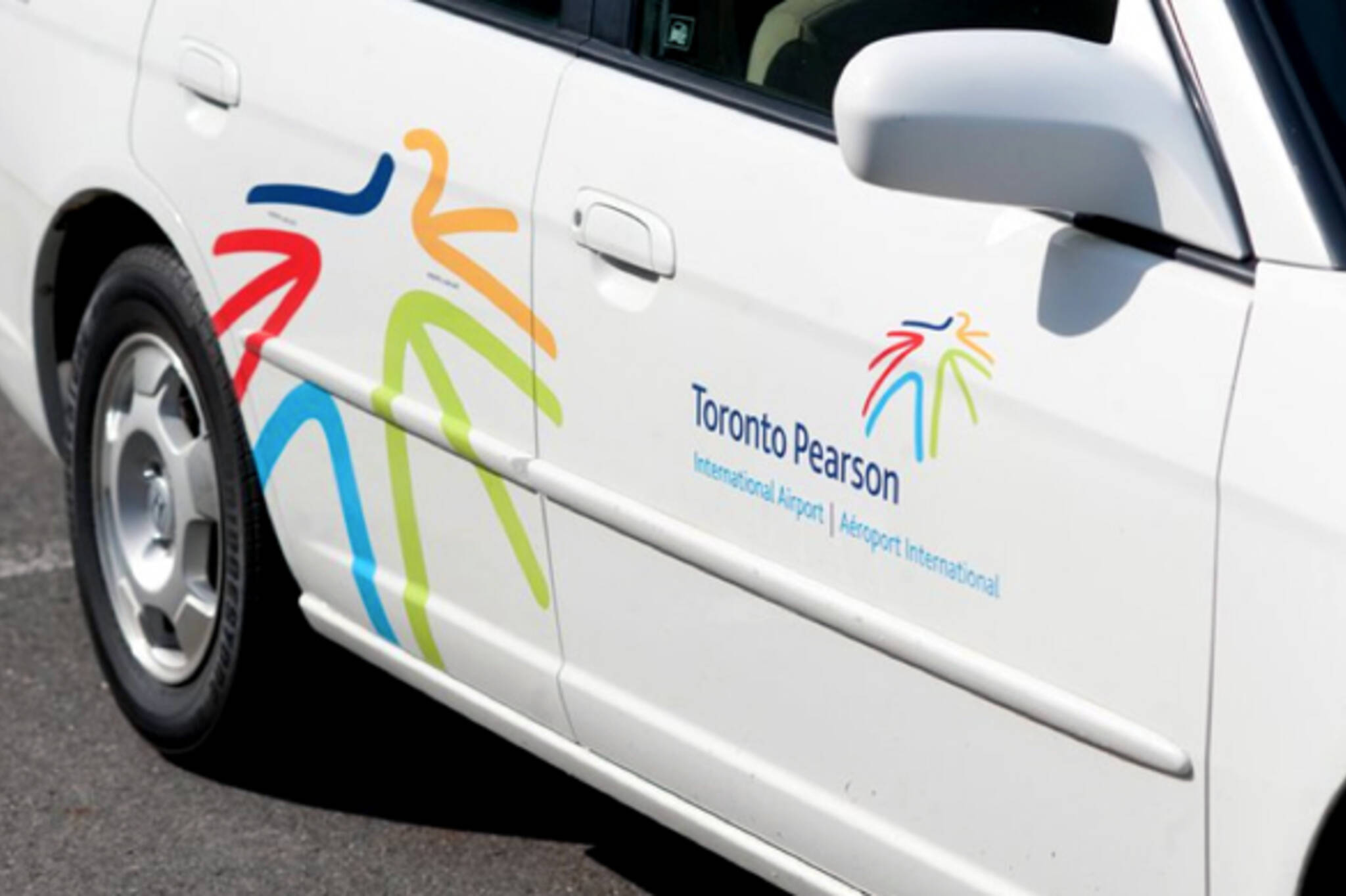
Pearson International Airport announced a major rebranding effort today, the centrepiece of which is a new logo. Well, maybe it's the centrepiece. There's also a new website as well as plans to improve guest services, retail and cultural offerings at the airport. But, really, it's the logo that's getting the early attention. I'm not surprised. Along with the fact that most everyone likes to weigh in on designs like this one, the Pearson PR people have attached some significance to the new logo and accompanying slogan, "For You. The World."
"The logo's multiple, vibrant colours represent the cultural diversity of Toronto and the world we provide access to. Together, the lines create a human figure that is embracing and reaching out to the world," says Pamela Griffith-Jones in a press release. "For You. The World" puts our customers at the centre of it all, conveying our commitment to being the ultimate host while reminding them of our global reach."
Well, that's one way of reading it. The most common observation that I've heard thrown around today, however, is that the colourful, blob-like figure looks like it has been run over by a plane and is now lying prone on the tarmac. Ouch. S/he does look kind of flattened, though.
What do you think? Hit or miss?
Latest Videos
Latest Videos
Join the conversation Load comments