A better map for the TTC?
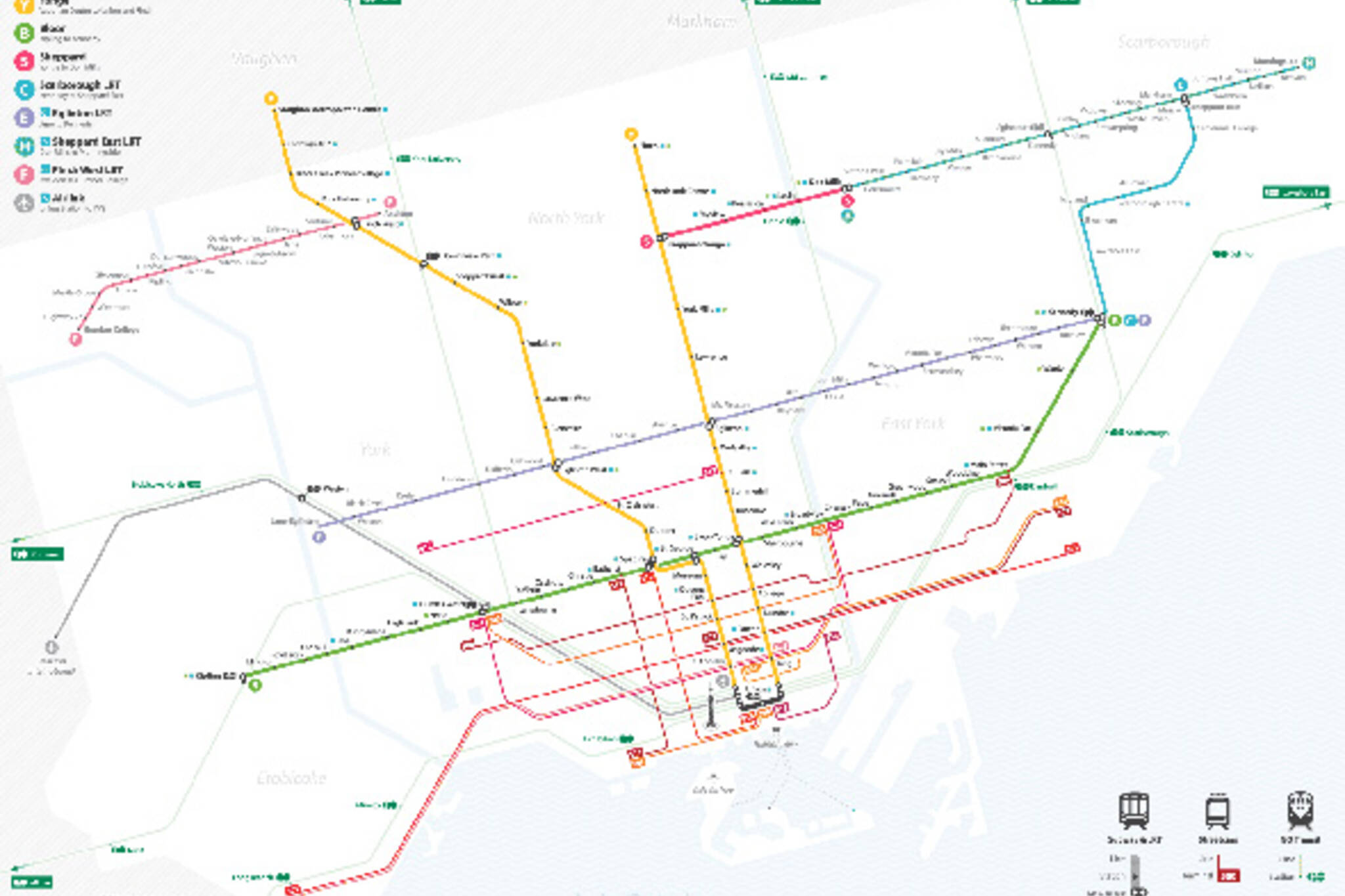
Now that streetcars, subways and buses are getting an overhaul, isn't it about time the TTC thought about updating some of the other things that help us all get around? Nick Caron thought so and just completed an unofficial redesign of the TTC's rapid transit map (view it larger here) along with some other tweaks like a new logo and names for RT lines.
Like many of us, Caron was deeply unsatisfied with the visual design of the current maps. He felt there was no consistency in appearance or level of information between the many maps the TTC uses in print and online. The map he's designed would be the first part of what he calls a "much simpler puzzle" and represents all the rail transit within the city including streetcars and GO transit.
He plans to create two other maps that would cover bus transit and the blue night service. He hopes the wide and ugly array currently in use can be discarded in favour of his much more efficient system that only presents information the traveller needs, when they need it.
What do you think? Would you like to see the TTC adopt this map?
Latest Videos
Latest Videos
Join the conversation Load comments


